
A practice, built end to end.
The identity, the public site, and the operations desk a London pain practice runs on. Designed, built, and still run by me.
Identity · Web · Product · Operations
The identity, the public site, and the operations desk a London pain practice runs on. Designed, built, and still run by me.
Identity · Web · Product · Operations




My friend Vanessa opened a pain coaching practice in London, and I built the whole thing she runs it on. The identity and the public site were the visible part. Underneath them were three larger opportunities: one place for the practice to run from, a client path that holds its own order, and a front door that speaks the practice’s language. Each became a system the team runs every day.
Vanessa Blackstone wrote The Pain Reprocessing Therapy Workbook and led the Pain Psychology Center in Los Angeles. In 2026 she decided to open her own practice in London. The clinical side was already hers. What the practice needed was everything around it.
Without it, the practice would have run the way most small practices do. Enquiries in a shared inbox. A spreadsheet of who is with which coach. Agreements in email threads, payments chased by hand, and a founder answering “where are we with this client?” from her phone between calls. Nine people, and no single place any of them could look.
So I built one. The identity and the public site are the part people see, and they were designed first so the desk behind them would speak the same language. The desk is where the leverage was, so that is where the building started. What changed is simple to say: every enquiry has a file, every client walks the same three steps in the same order, and the team runs the practice from one screen instead of everywhere.
The desk One operations platform shaped around the client’s journey, where each role sees only what it needs.
Sign, pay, book A client path in a fixed order, held by the server instead of a checklist.
The front door The identity and the public site, written in the practice’s own vocabulary.
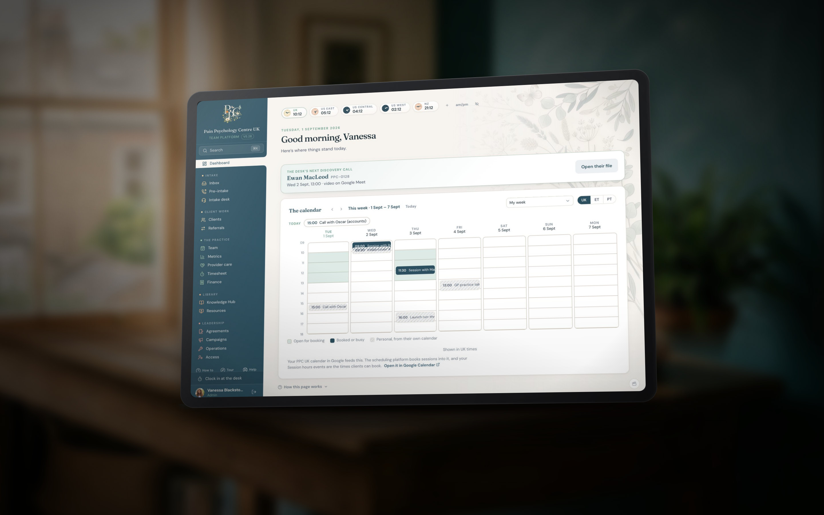
Everything a client touches, from the first enquiry to the coach’s payout, lives in one system. The organizing idea is the client’s journey: twelve stages in four phases, and every page is a window onto part of it.
The opportunity. A new practice with nine people, a founder who runs it from a tablet, and no operating system yet. Every tool the team might have reached for was built around someone else’s workflow. The opening was a desk shaped around this practice’s own journey, where the team sees only what its role needs.
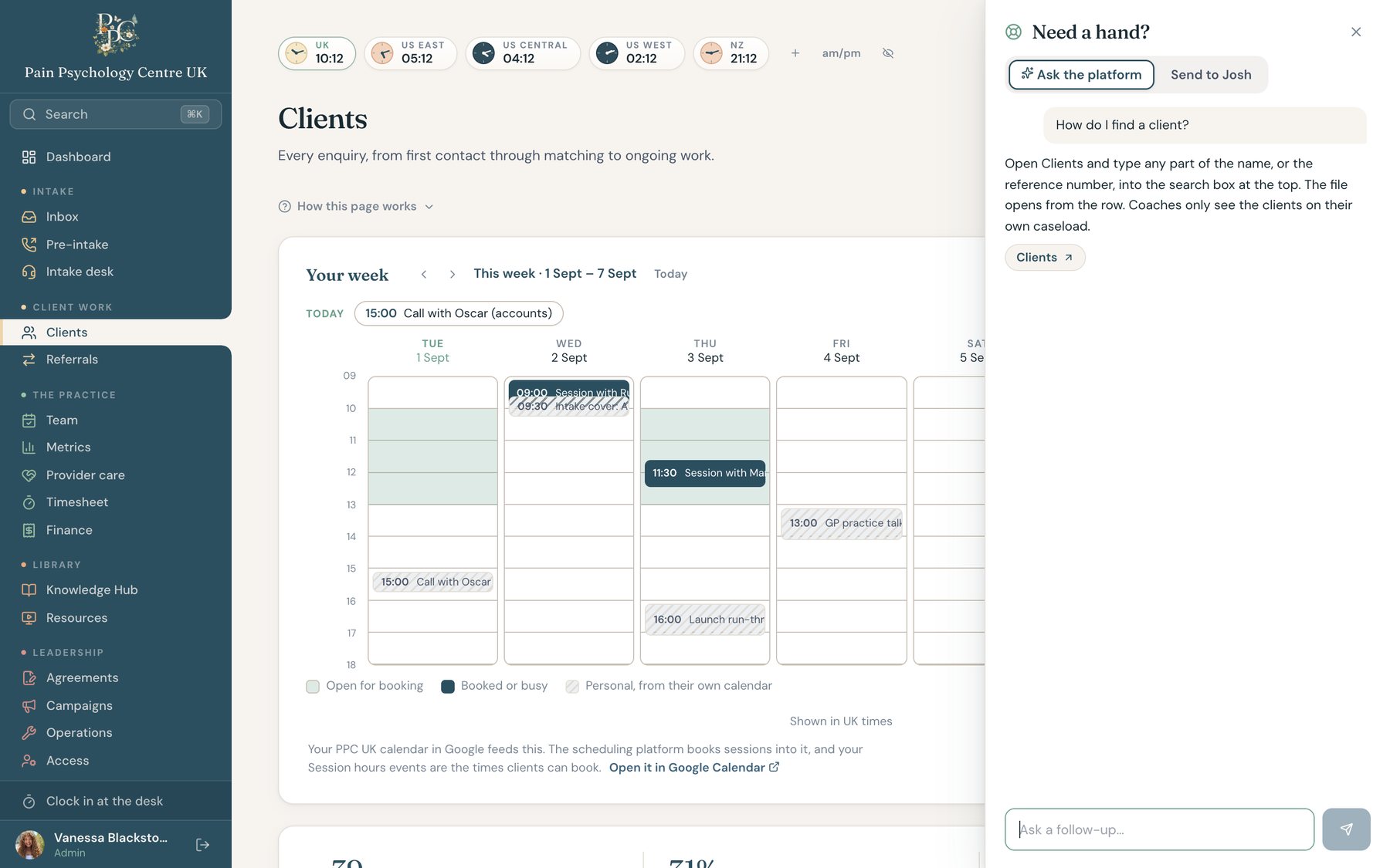
The system. One platform with the journey as its spine. Roles scope the view: coaches see their own clients and their own week, the intake desk sees everything, leadership sees the money. It starts on Home, a calm noticeboard with the next call first, and it had to work on a tablet before it worked on a laptop.
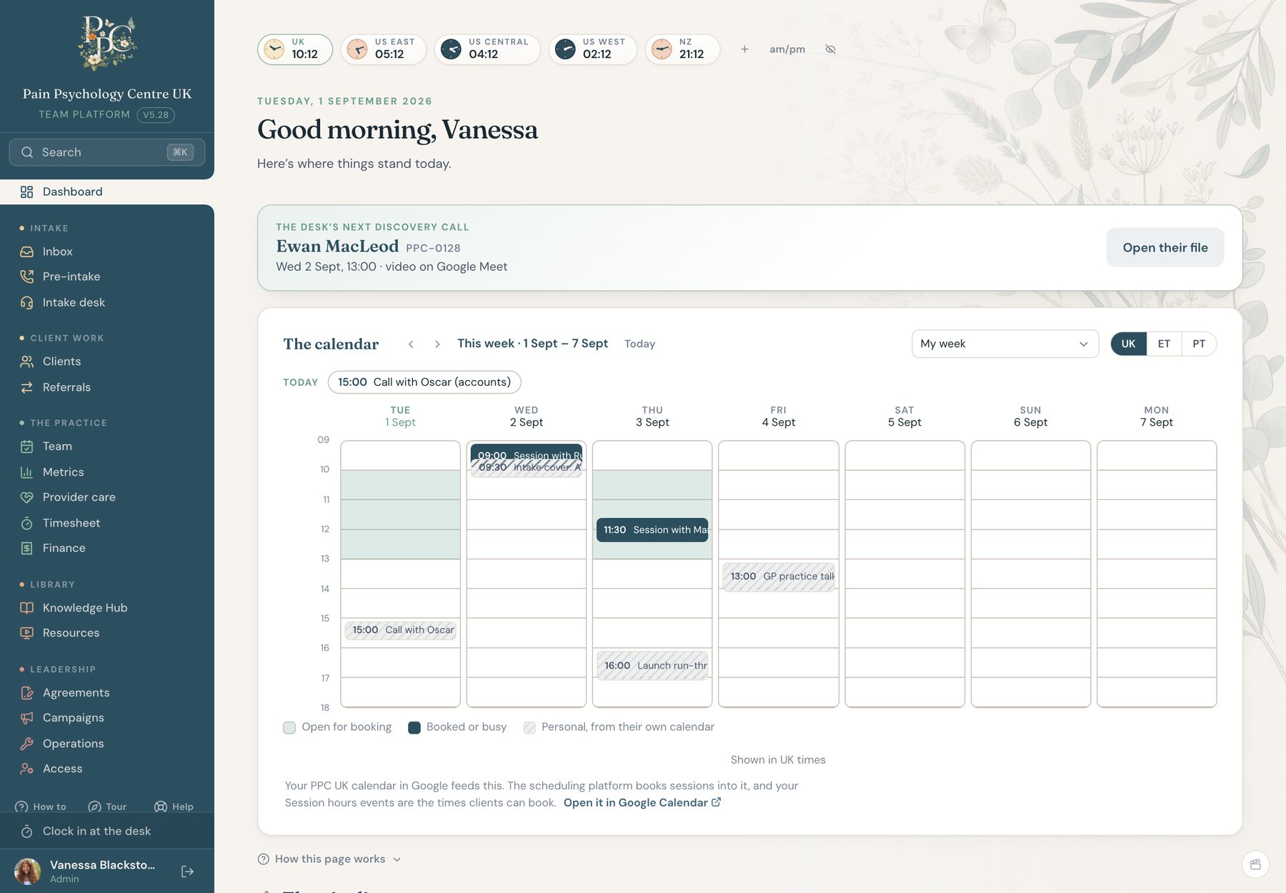
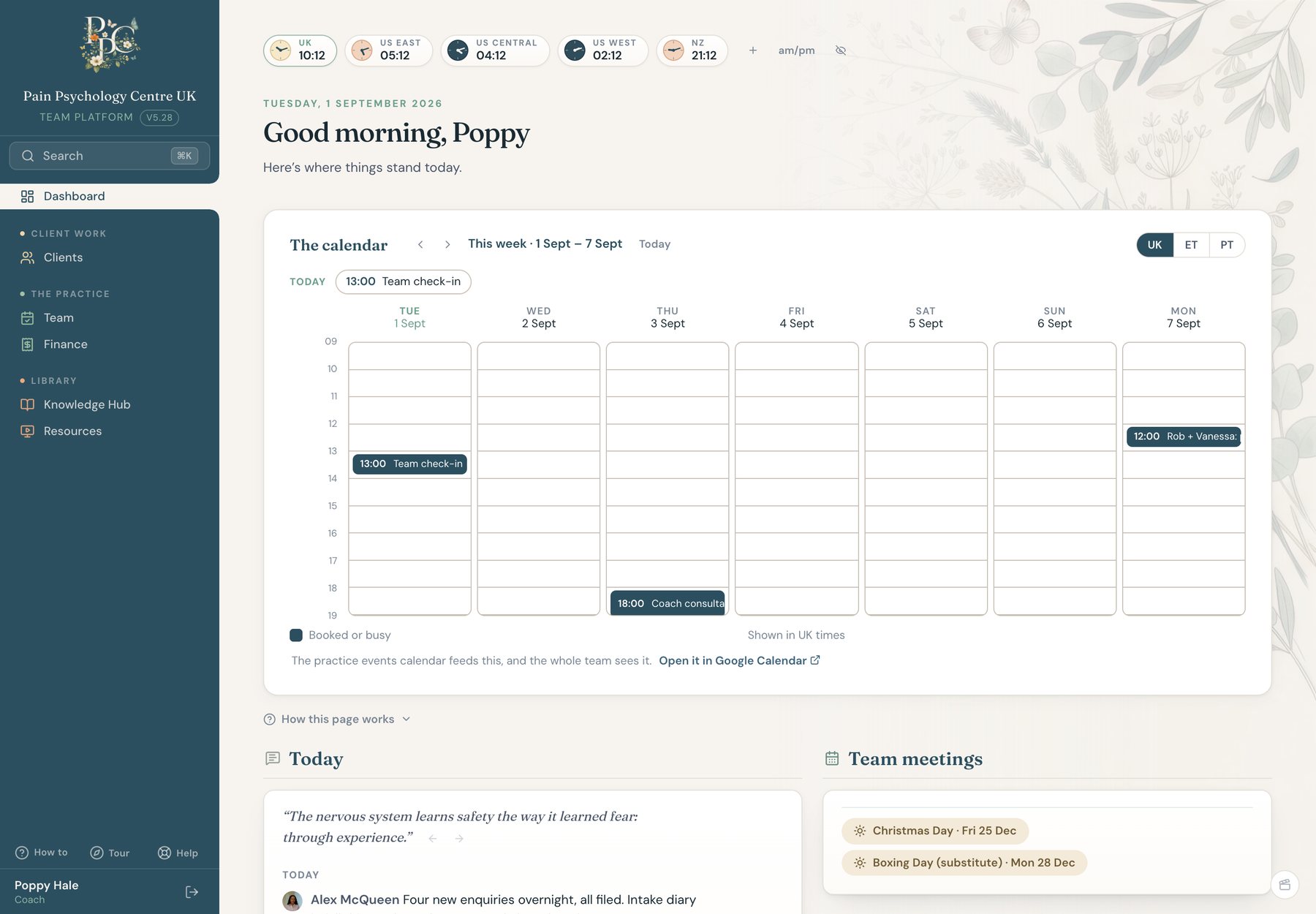
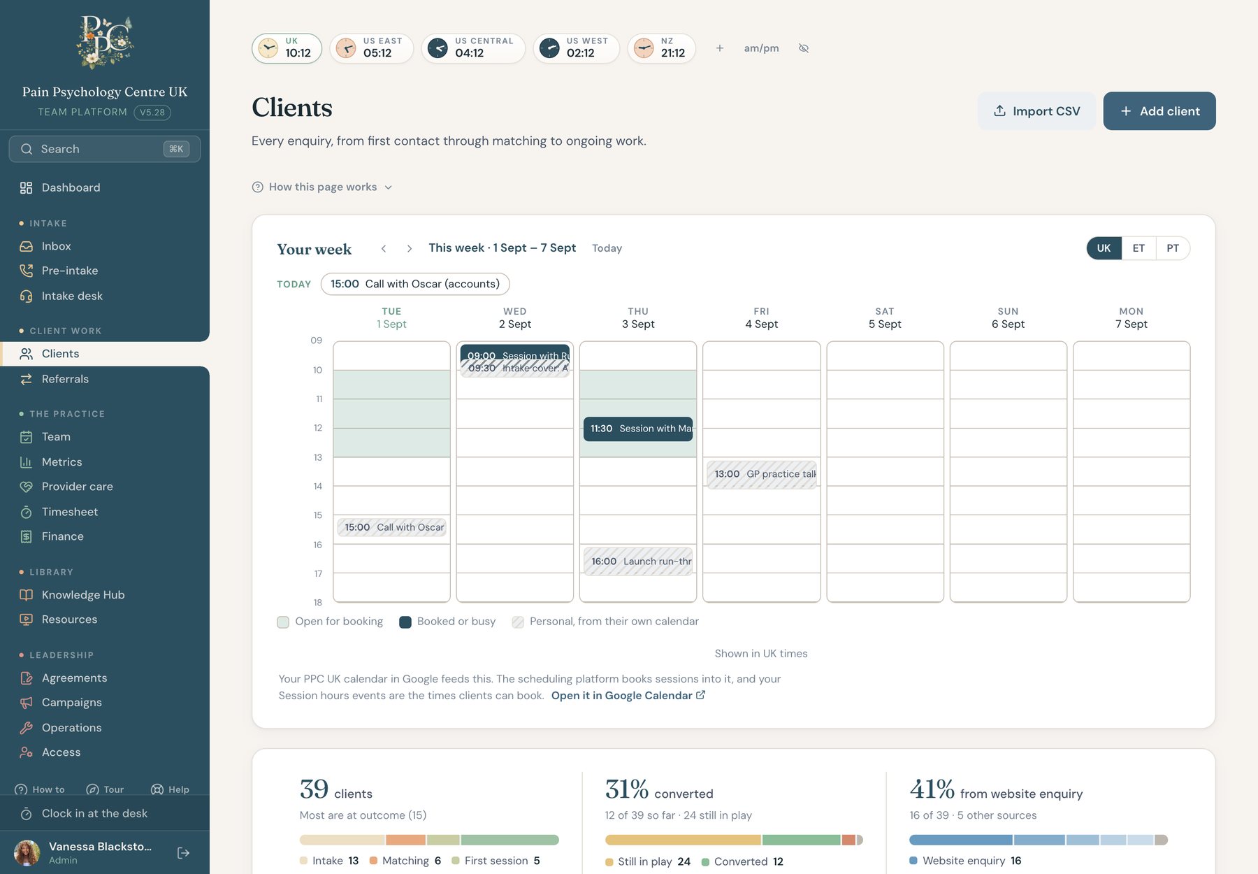
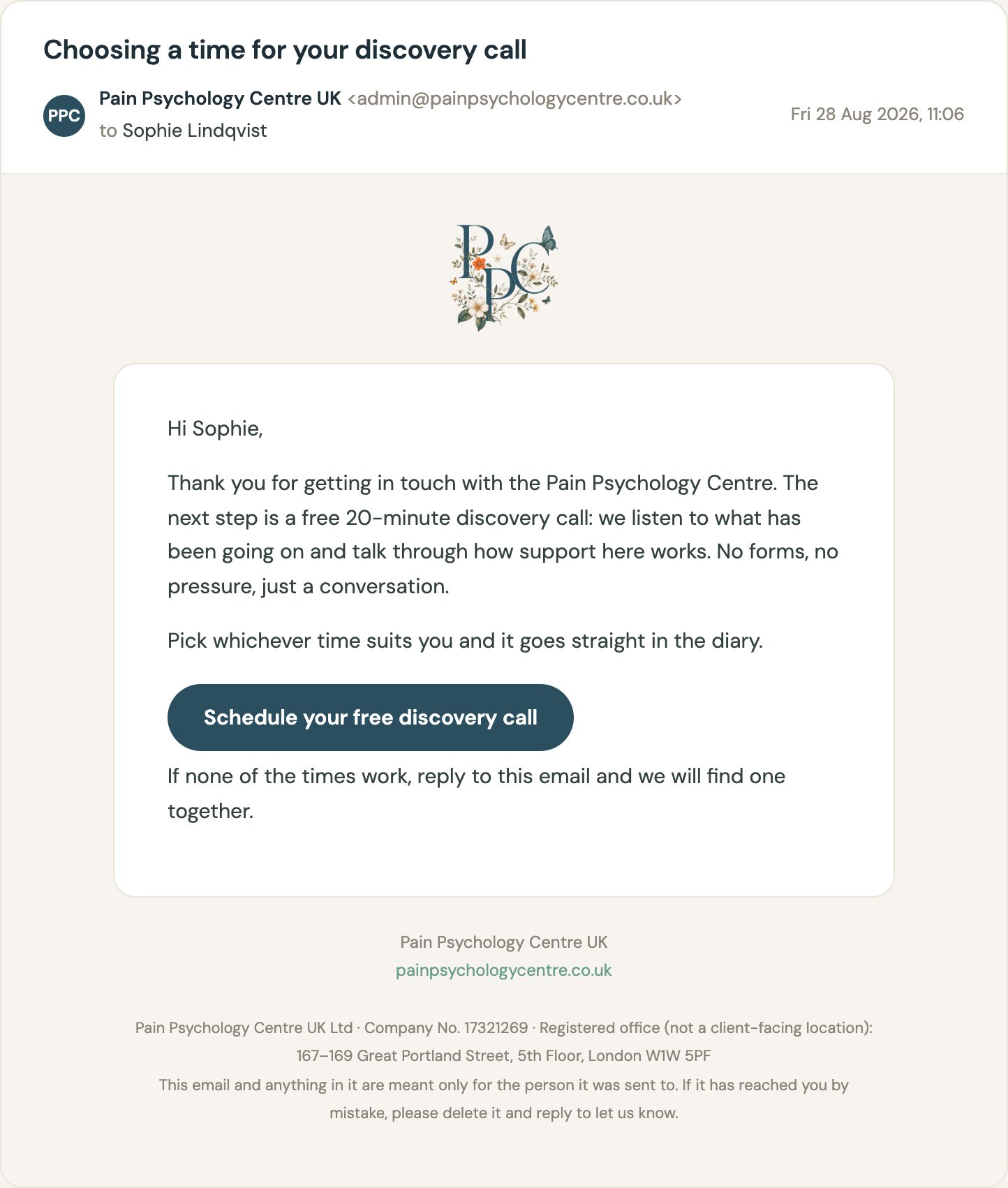
When someone writes through the website, the message does not go to an inbox somebody forgets to check. It lands on the platform as an enquiry, matched against existing files, and it emails the desk at the same moment. One click turns it into a pre-intake file.
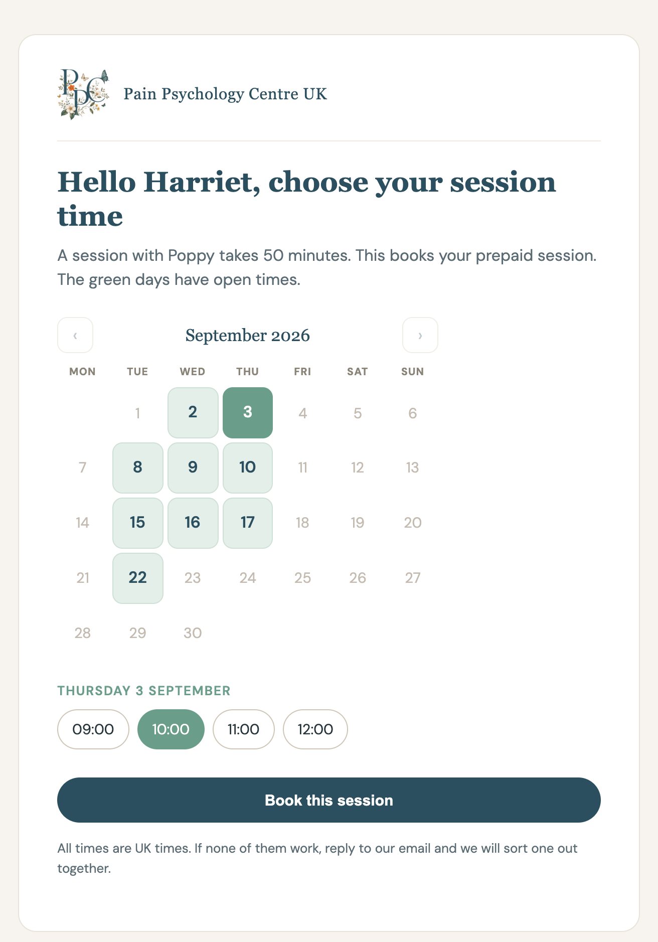
The client books the discovery call from a page the platform mints for them, off the coordinator’s real diary. On the call, the file fills in as the coordinator listens: what they need, their preferences, and a ranked list of who fits. The referral is one click, and any concern flags quietly to leadership.
Enquiry A website message becomes a file in one click, matched against existing files.
Pre-intake Three contact attempts, a booking link that logs itself, and a page the client books from.
The call The file fills in as the coordinator listens. Safeguarding is asked here.
Match Providers ranked by openings, load, and fit. The referral is one click.
Introduced One email with three ordered steps. The client takes it from here.
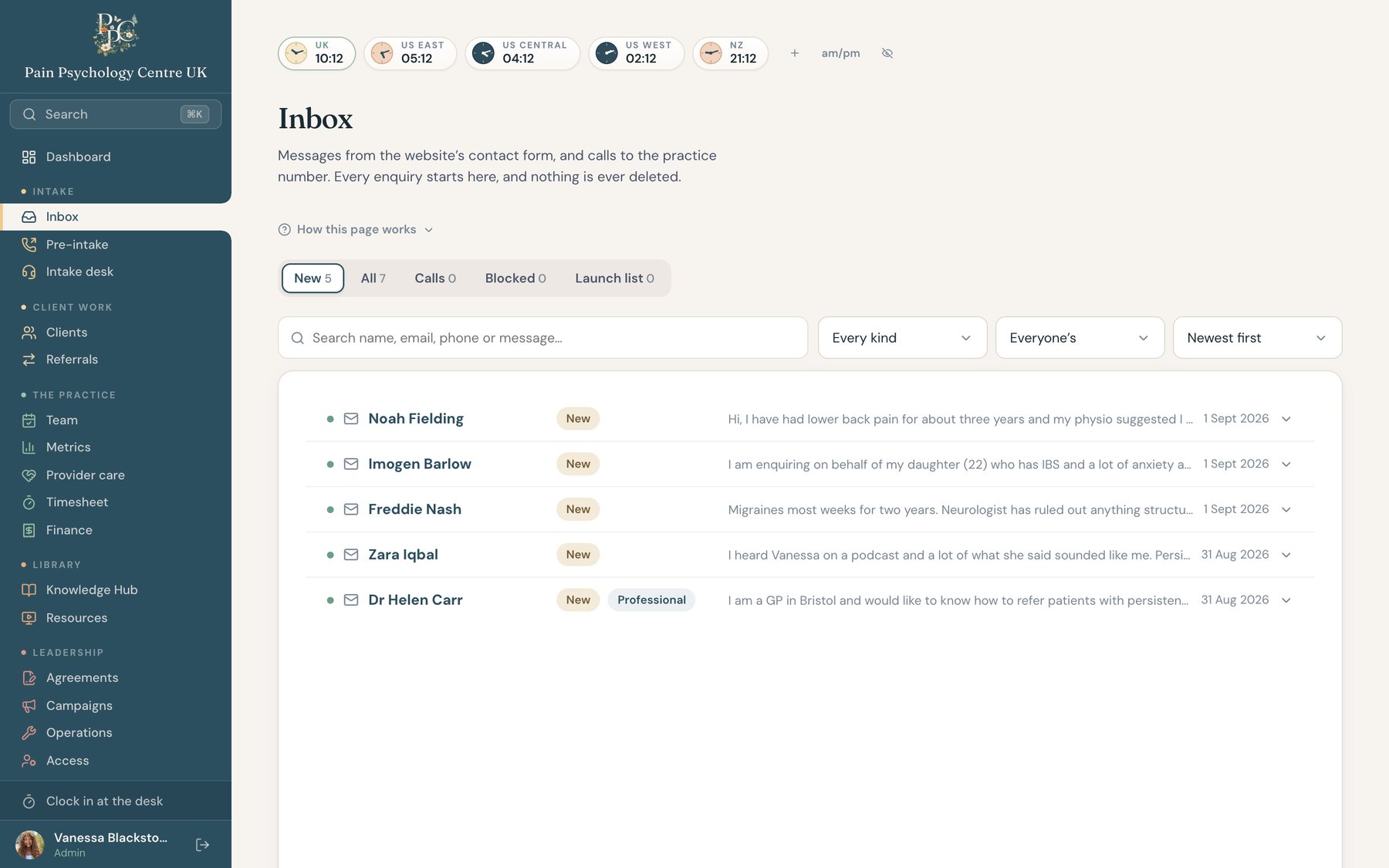
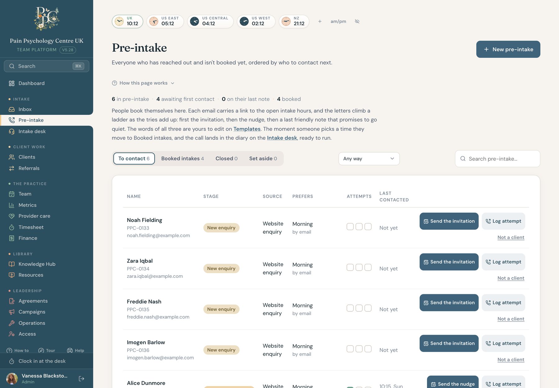
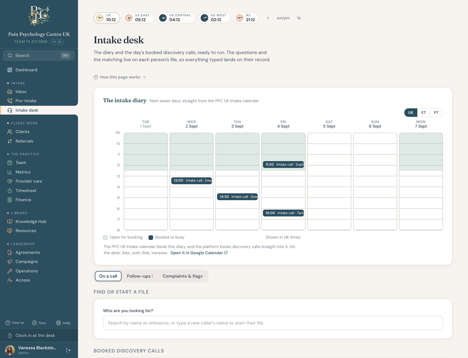
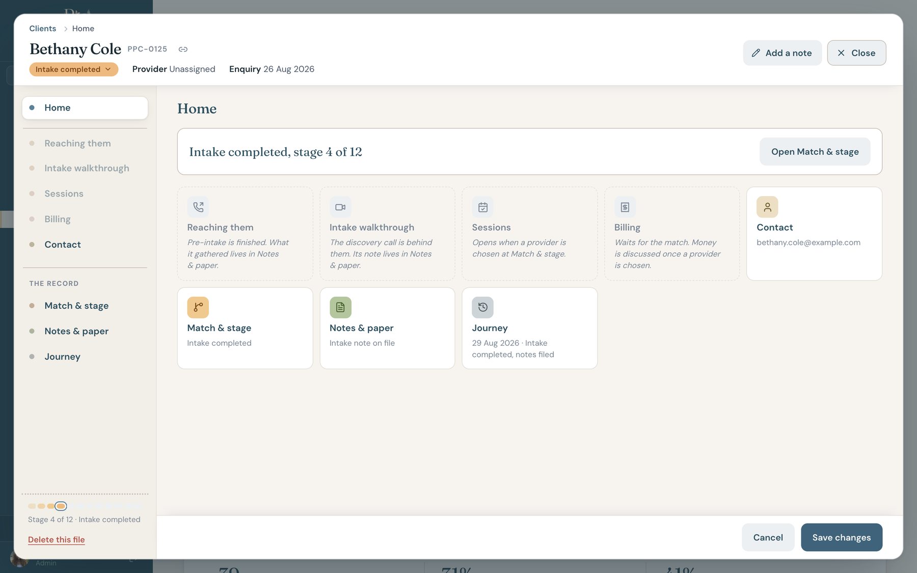
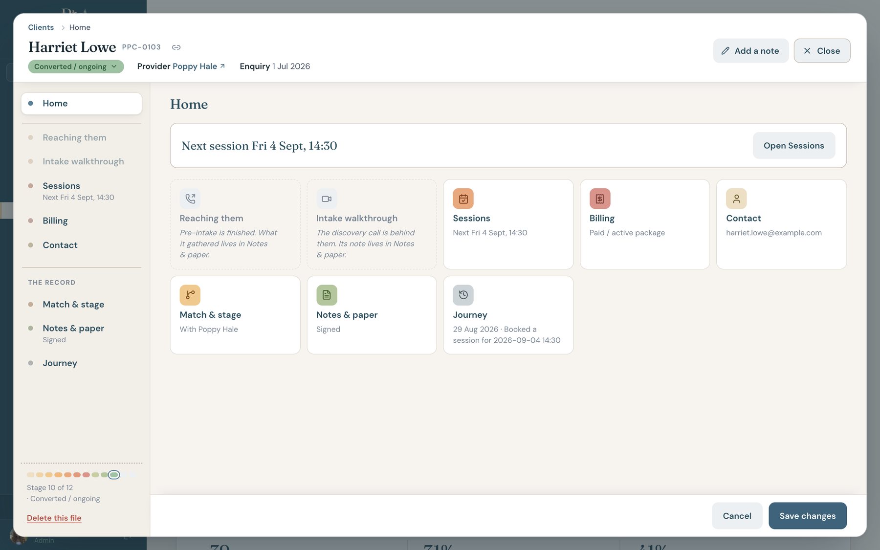
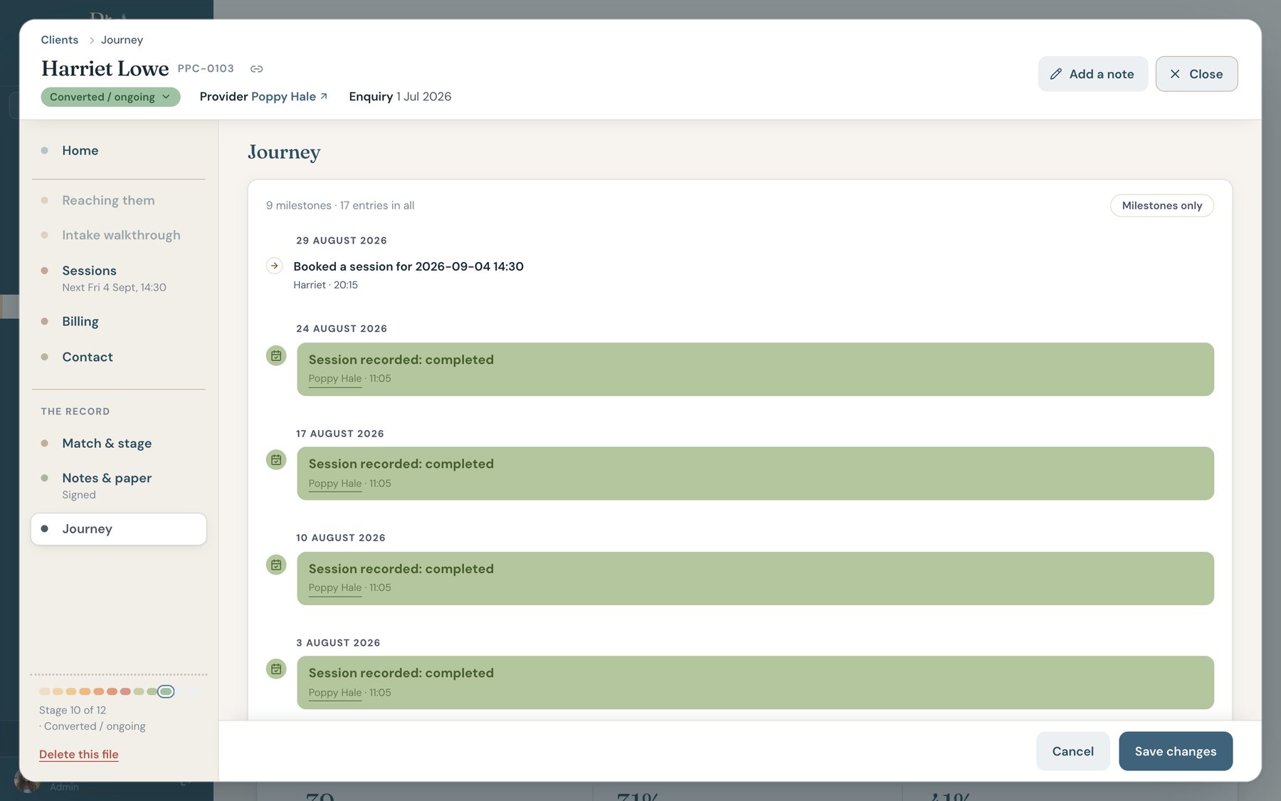
Every client has one file. The colored band across the top is their journey, and the Journey tab is the whole history, written automatically as things happen. The file grows with the client: a working file at intake, paperwork and billing once there is a match, sessions once there is a provider.
Every tab and filter lives in the URL, so a link to a file is a link to that exact view. Files open in place. Nothing moves you off the page while someone is on the phone.
A sketch of the internal system: one client file, as the desk sees it.
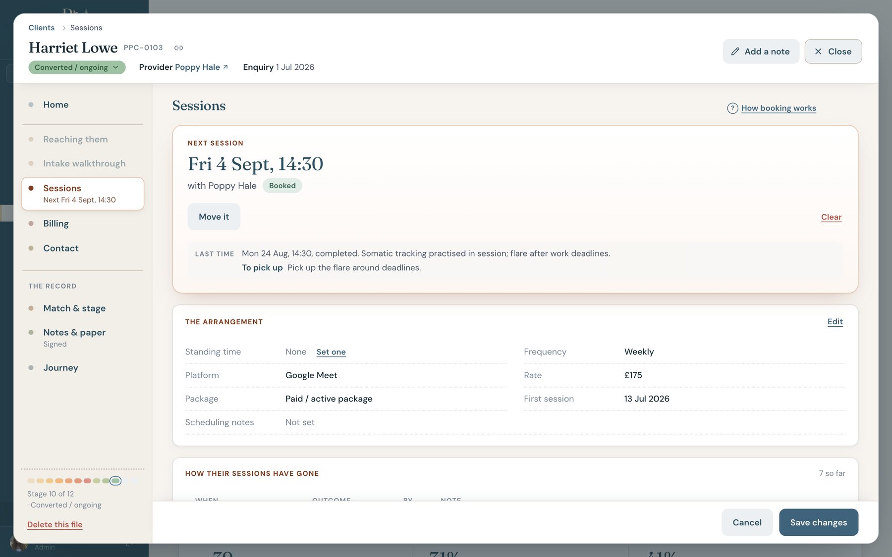
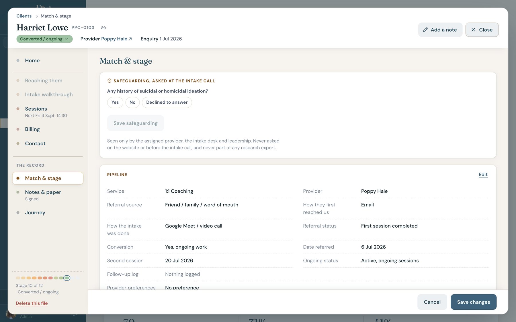
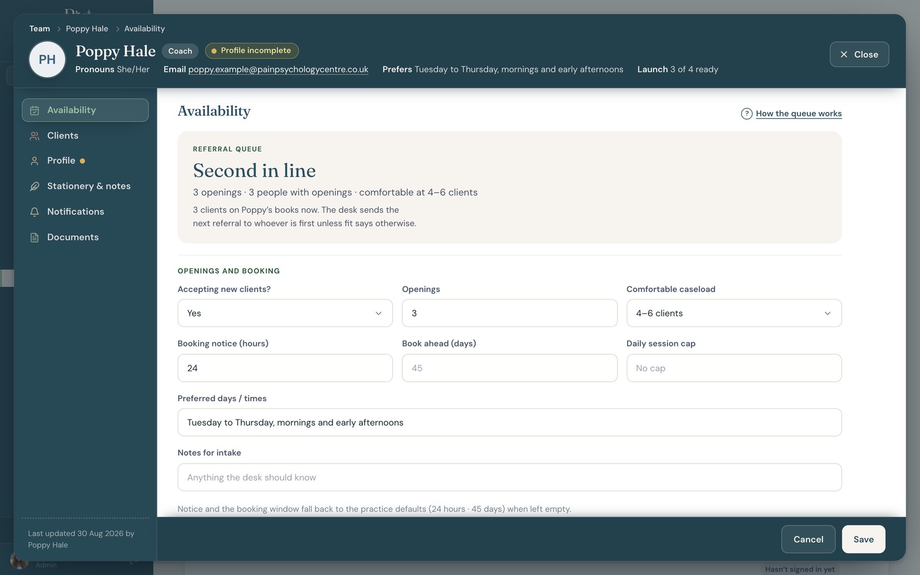
Providers keep their own profile, availability, and preferences current through a setup wizard, and their hours write real recurring events to the shared calendar. The desk sees a live referral queue ranked by who is ready for the next client, and launch readiness per person: agreement, profile, insurance, payout details. Coaches get a deliberately slim app. Their week, their clients, their hours, and help.

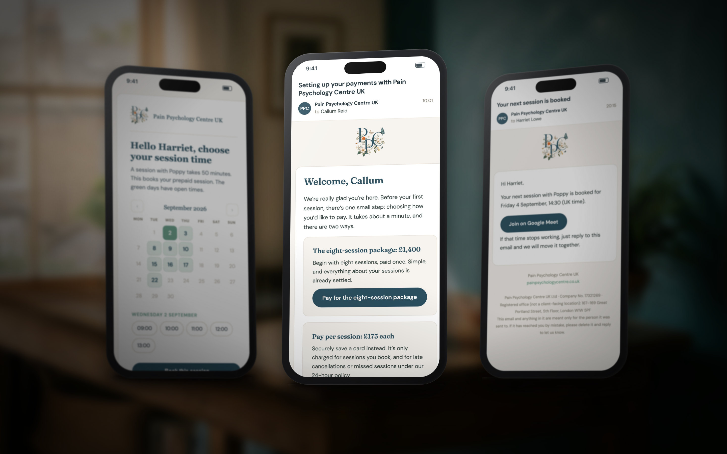
A client cannot book a session before the paperwork exists. The agreements, the payment, and the booking are three steps in a fixed order, and the server holds the order, not a checklist.
The opportunity. A coaching practice runs on trust and paperwork in equal parts: agreements on the lawyer’s wording, payment before sessions, sessions booked against real hours. Done by hand, each of those is a step someone can miss on a busy day. The opening was a path the client walks on their own, in the right order, with the practice watching, not chasing.
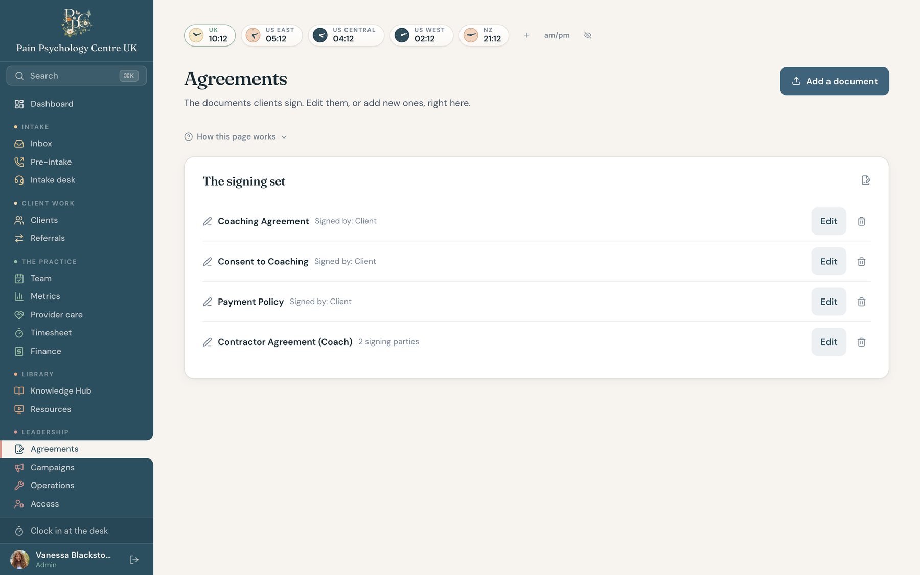
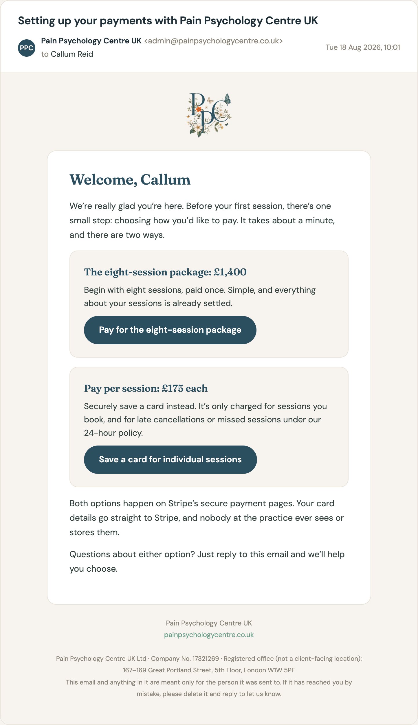
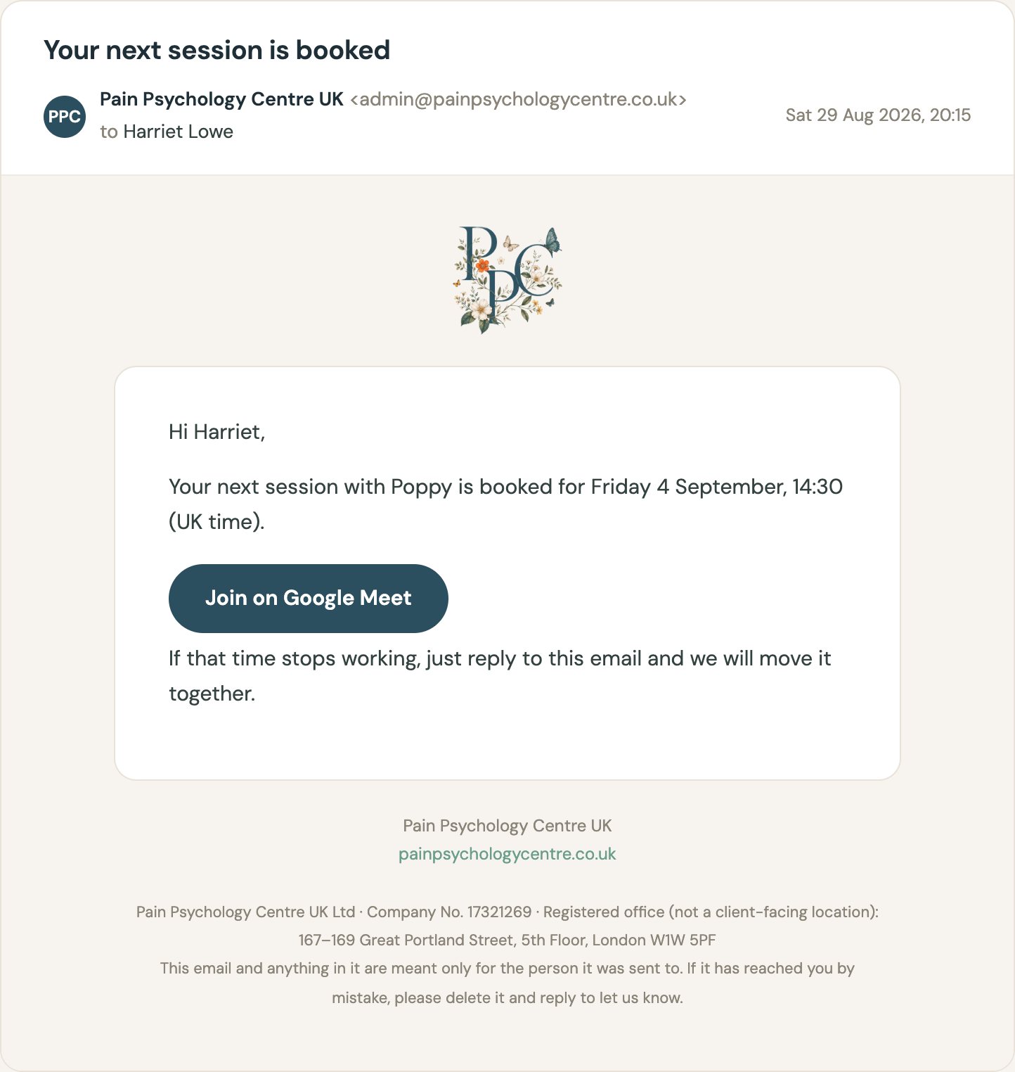
The system. One introduction email with three ordered steps. Agreements go out for e-signature from inside the file, branded, from the practice’s own address, and the signed PDFs file themselves. Payment happens on Stripe’s page, so no card number ever touches the platform. Booking opens only when both are done, from the provider’s real session hours, and lands on both calendars with a Meet link.
The client sees three doors, one at a time. The first is the signing pack, two documents in one sitting. The second is Stripe’s payment page. The third is a booking page drawn from the provider’s real session hours. The practice sees the same three steps on the file, with the step the client is on marked, so nobody has to ask where things stand.
A sketch of the client path. Each step unlocks the next.
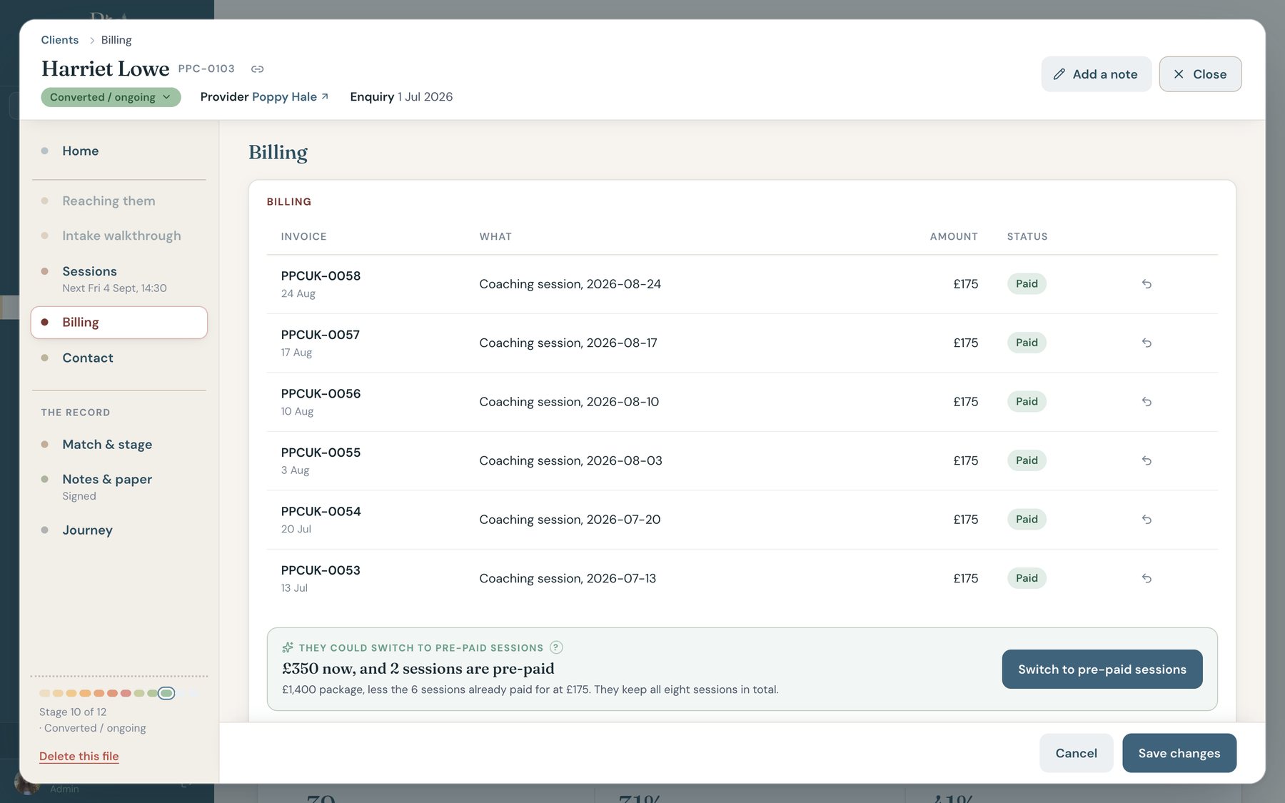
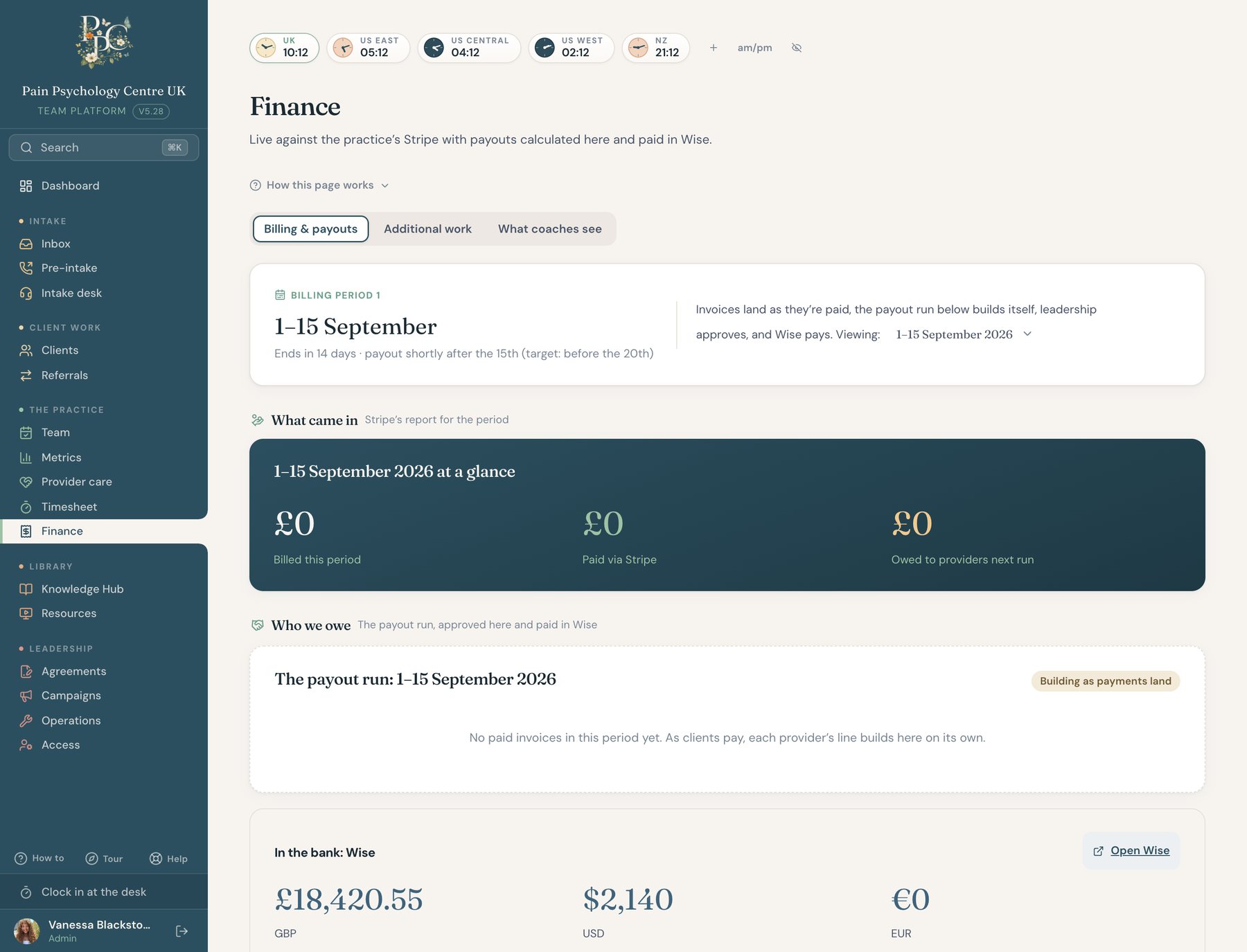
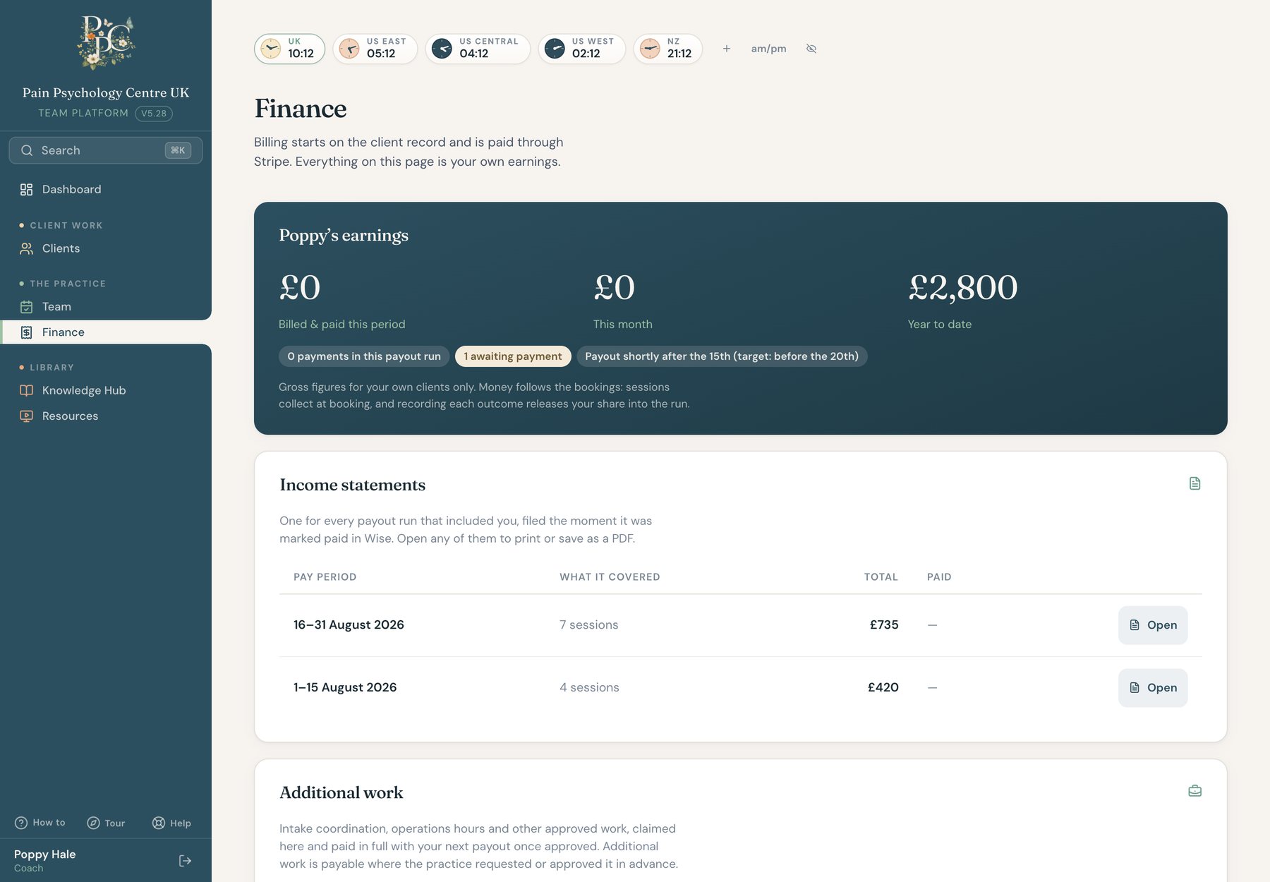
Stripe is the truth about payments. The bank is the truth about cash. The platform mirrors both and never holds money. Packages count themselves down as sessions are delivered, reminders chase politely, and each delivered session releases the provider’s share into a payout run that builds itself. Coaches never touch money. Their earnings view shows their side and nothing else.
A sketch of how the money moves. The finance page itself is in the strip below.
Two sources of truth. Payments live in Stripe, cash lives in the bank. The platform reads both and writes neither.
Packages count themselves. A delivered session takes one off the package. A reminder goes out before the last one.
The payout run builds itself. Each delivered session releases the provider’s share. The period closes with one review, not a spreadsheet.
Coaches see their side. Sessions delivered and the share released. No invoices, no bookkeeping, no card numbers.
Leadership sees the billing period at a glance: billed, paid, and owed to providers, with the payout run building underneath as clients pay. A coach opens the same page and sees only their own earnings and their income statements.
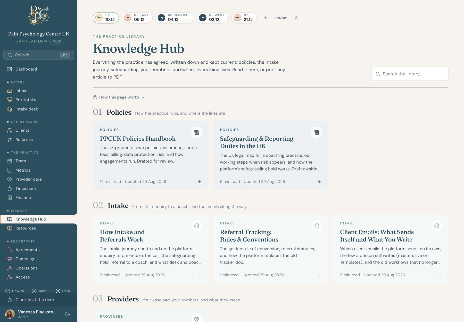
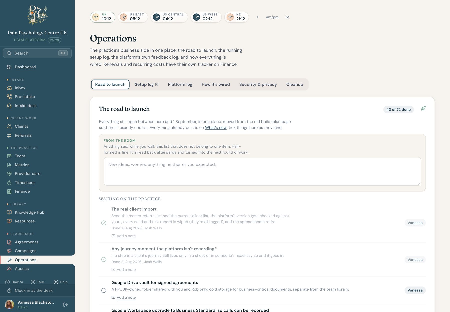
Policies live in the Knowledge hub. Operations holds a plain-language security brief: where data lives, who sees what, and what the platform deliberately never keeps. Vanessa’s one hard line was that this must never become a clinical record system, so there are no session notes anywhere, client data is scoped by role in the database rules, and everything runs in Google’s London region.
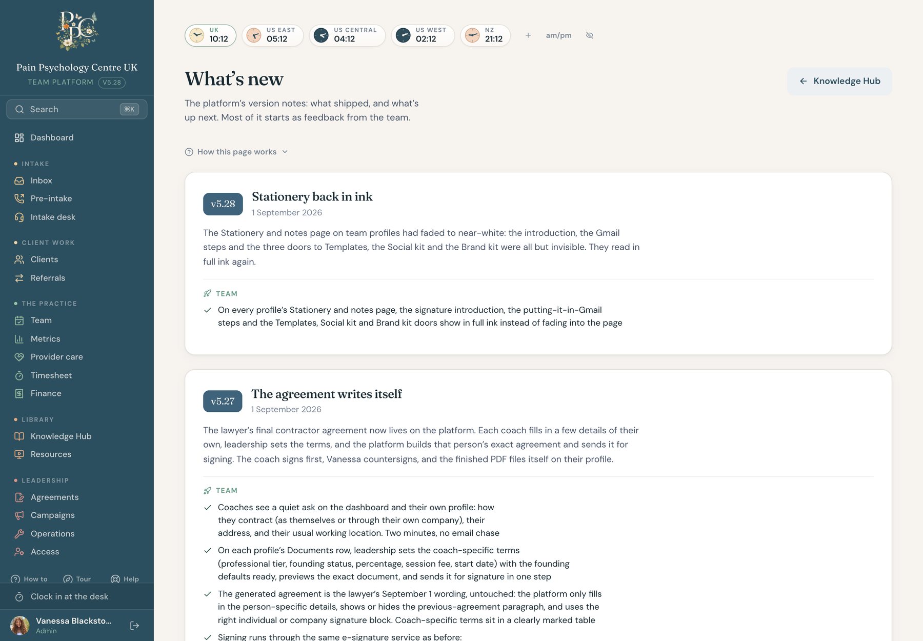
A practice changes every week, so the platform ships every week. Every release is written up in plain language on a What’s new page, feedback goes into a platform log with its source, and a help book of short recipes answers the everyday questions. The version number sits in the corner of every screen.
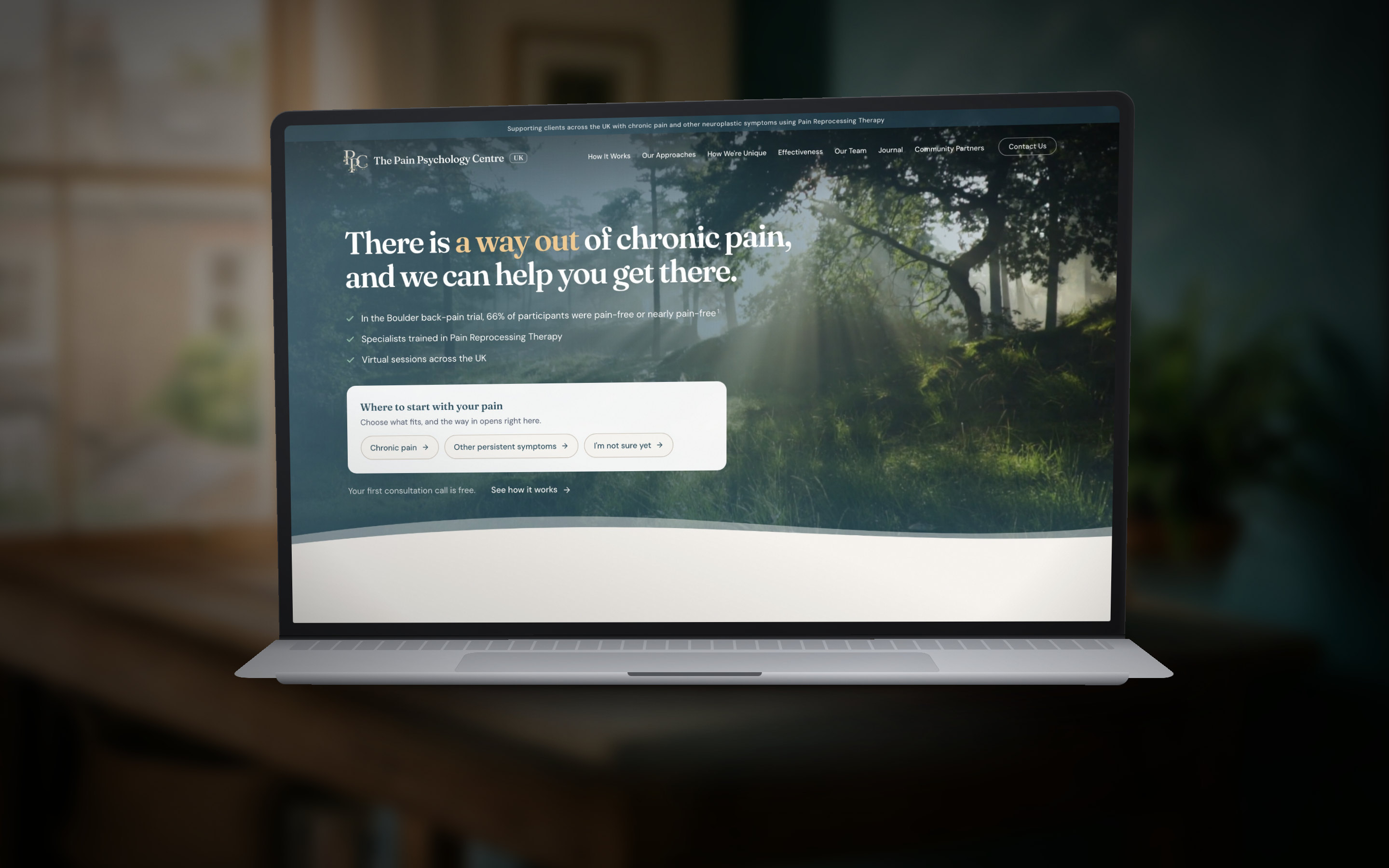
People arrive at a pain practice tired and skeptical. So the brand does the opposite of a clinic, and the site speaks in the practice’s own vocabulary.
The opportunity. The practice needed a name people could see and a site that made the first contact easy, for an audience that has usually tried everything else first. The opening was a front door that felt like a calm room rather than a waiting room, with a contact form that was already the first screen of the desk.
The system. A floral monogram in deep teal, an earth-tone palette drawn first for the journey band and then pushed out to the site so both surfaces wear the same weather, Fraunces for headings, DM Sans for everything else, cream ground, film grain. One responsive codebase, static and fast. The brand guide is published as a page on the site.
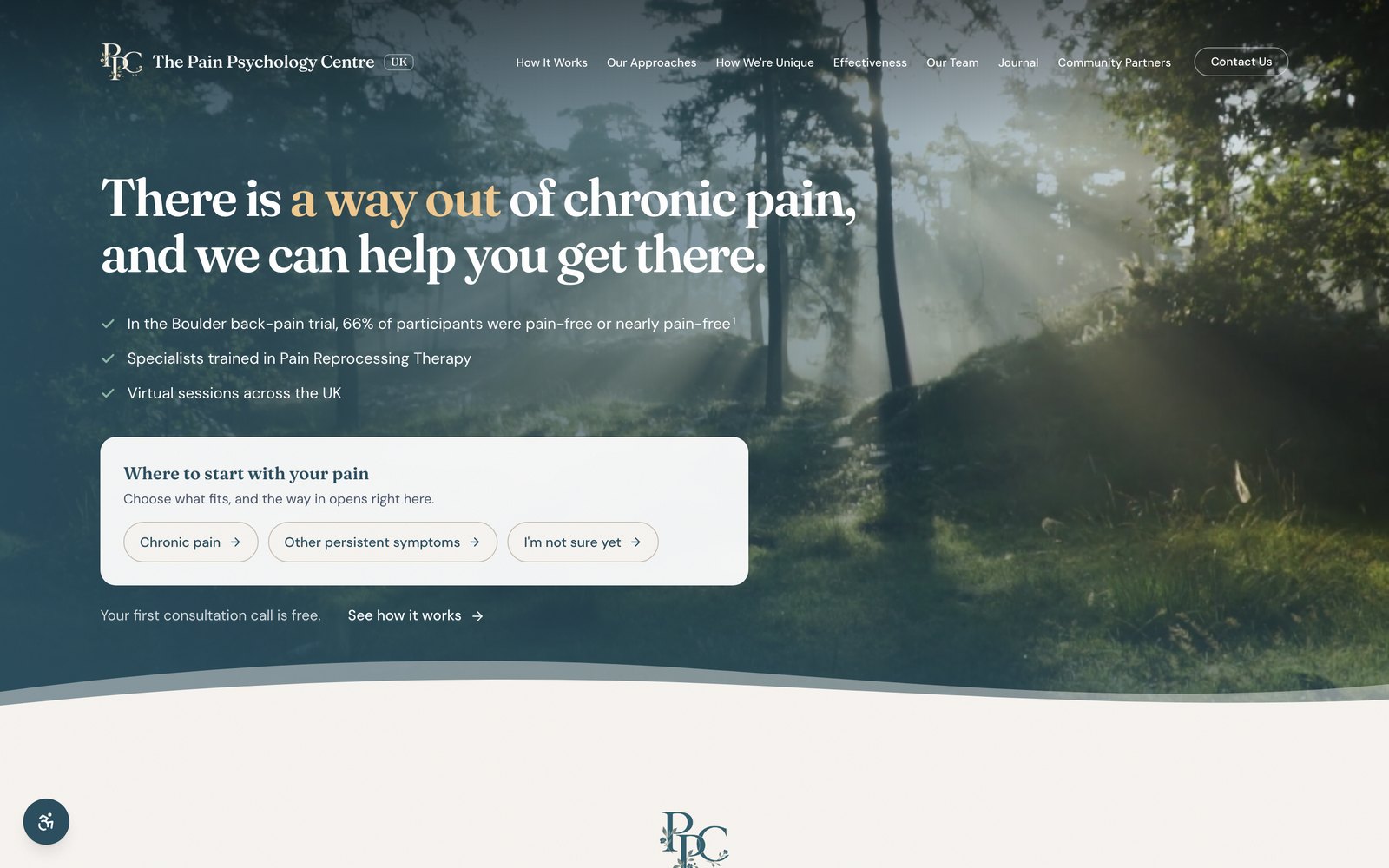
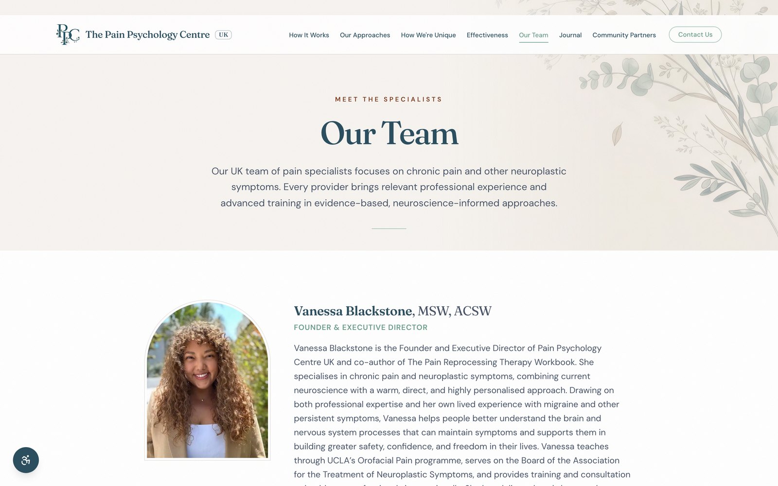
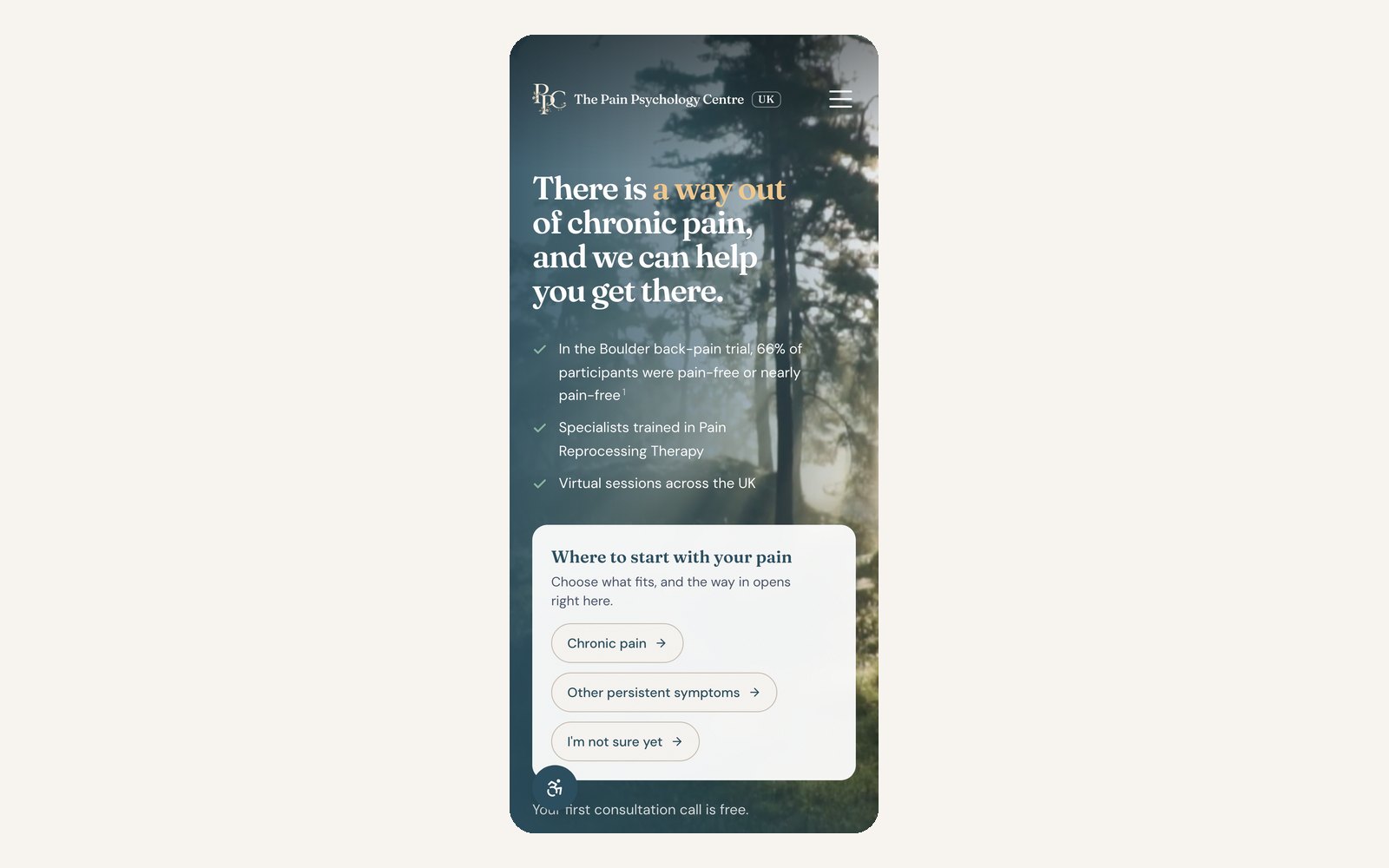
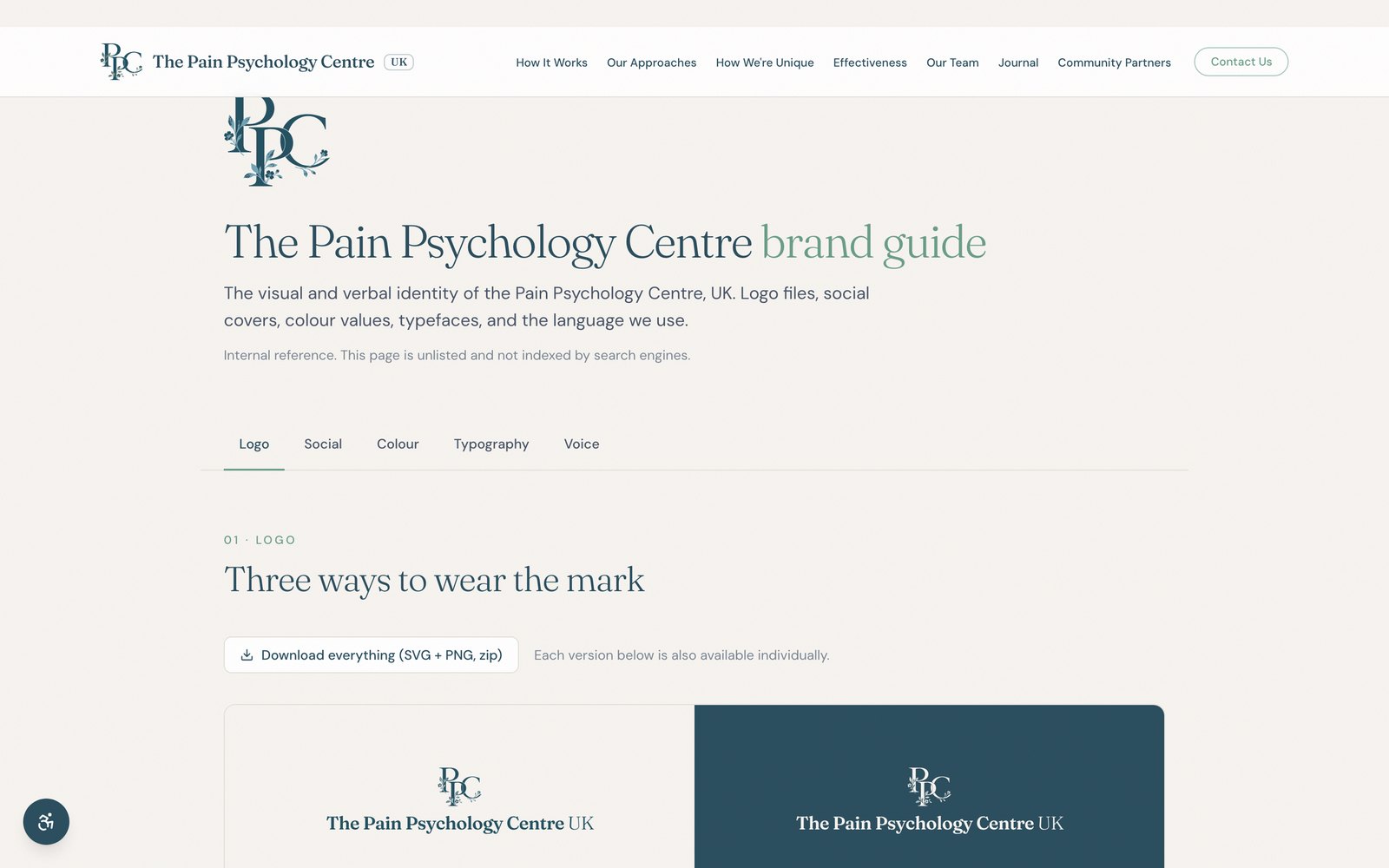
A brand for a pain practice has to do the opposite of a clinic. The monogram is botanical rather than medical, the ground is cream rather than white, and the earth tones were drawn for the journey band first, where a client’s own progress is coloured, then pushed out to the site so both surfaces wear the same weather. The type splits the same way: Fraunces for the things the practice says, DM Sans for everything it explains.
The words are part of the system too. Client, not patient. Provider, not clinician. Sessions, not treatment. Centre, not center. A practice careful about language in the room should be careful about it on the page, so the word choices are written down beside the hex values and the clear-space rule, and the whole thing is published as a page the team can send to anyone.





The quiet one. It carries every paragraph, caption and field label on the site and in the desk.
A sentence with one accented word.
Sessions are virtual only.
“Registered office only. Not a client-facing location.”
Attributed to participants in the Boulder trial, Ashar et al., 2022, with citation.
Every part of the system improved after a real day exposed a missing rule. The point was not to be right after the fact. It was to keep the same thing from happening twice.
A save that knew less than the server. A file edit written seconds after a referral undid it. Now the client-side save folds the same fields the server does, and nothing writes what it has not read.
A form field that texted the wrong person. An e-signature phone field verified the number typed into it, which was the emergency contact’s. Phone fields on agreements are plain text now.
The tablet comes first. The founder runs the practice from a tablet, so every drawer, dialog, and scroll lock is checked there before a laptop.
Every view is a link. A tab or a filter that is not in the URL cannot be shared on a call. Now every one of them is.
The work came down to judgment: what to fix in place, what to leave to the people, and when a technically complete feature was still the wrong one for a practice run from a tablet between calls. I designed the identity, wrote the copy, built the site, built the platform, wired the email, the domains and the payments, and I still run all of it. If you are building a small operation that needs to feel like a real product on day one, this is what that looks like.
Identity. The floral monogram, the earth-tone palette, and the type system, published as a brand guide.
Public site. One responsive codebase, static and fast, written under the practice’s own vocabulary.
Operations platform. Inbox to outcome in twelve stages, with every view a link.
Sign, pay, book. DocuSeal, Stripe, and Meet, enforced in order on the server.
Money mirrored. Stripe for payments, the bank for cash, the platform never holds a penny.
Email and infrastructure. Workspace, domains, DNS, and branded mail from plain text.
Three opportunities came with the brief: a practice that needed one place to run from, a client path that could hold its own order, and a front door that spoke the practice’s language. Each got a system, and each one runs every day. I asked the person who runs the practice to say in her own words whether that holds.
“Josh took a vision I had for Pain Psychology Centre UK and turned it into a platform that feels completely our own. He understood not only what we needed technically, but how we wanted the entire experience to feel for our team and clients. He is incredibly thoughtful, creative, responsive, and somehow always finds a way to make even my most ambitious ideas work. Building this with him has been one of the easiest and most enjoyable parts of launching the business.”

Tell me what you're building and where it's stuck. I'll tell you honestly whether I'm the right person for it.