
A newsroom, built from scratch.
Banijay Studios North America hired me to build its first digital property. The Blast launched in September 2017: the brand, the site, the social system, and the deck that sold it.
Brand · Product · Social · Sales
Banijay Studios North America hired me to build its first digital property. The Blast launched in September 2017: the brand, the site, the social system, and the deck that sold it.
Brand · Product · Social · Sales

Banijay Studios North America makes television. In 2017 it decided to make a website, and hired me to design it. The Blast launched that September as the group’s first digital property: a celebrity newsroom with its own mark, its own site, and its own way of showing up in a feed. A year in, it was drawing three million visitors a month and a feature in The New York Times. This page goes piece by piece: the mark, the site, the feed, the deck.
Identity
One word, and a star in the A.
The Blast had to look like it belonged next to the names it was competing with, on day one. Most of those first impressions happen at the size of a social avatar. So the mark had to read at sixteen pixels and still carry a homepage: one word, with a star cut into the A, blue on black. The star works alone as the avatar and the app icon. The word works alone on a card.

The animated mark: the star draws itself in neon, then the word lands beside it. Every clip The Blast published opened and closed with a cut of this.
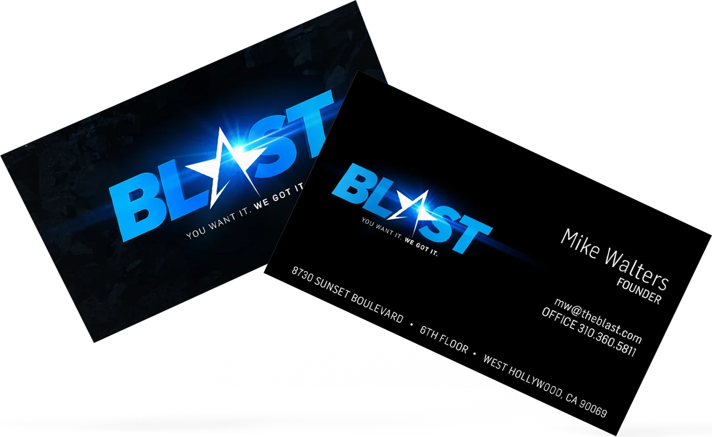
Launch, September 2017 · Redesign, Summer 2018
The story first, on a phone, at two in the morning.
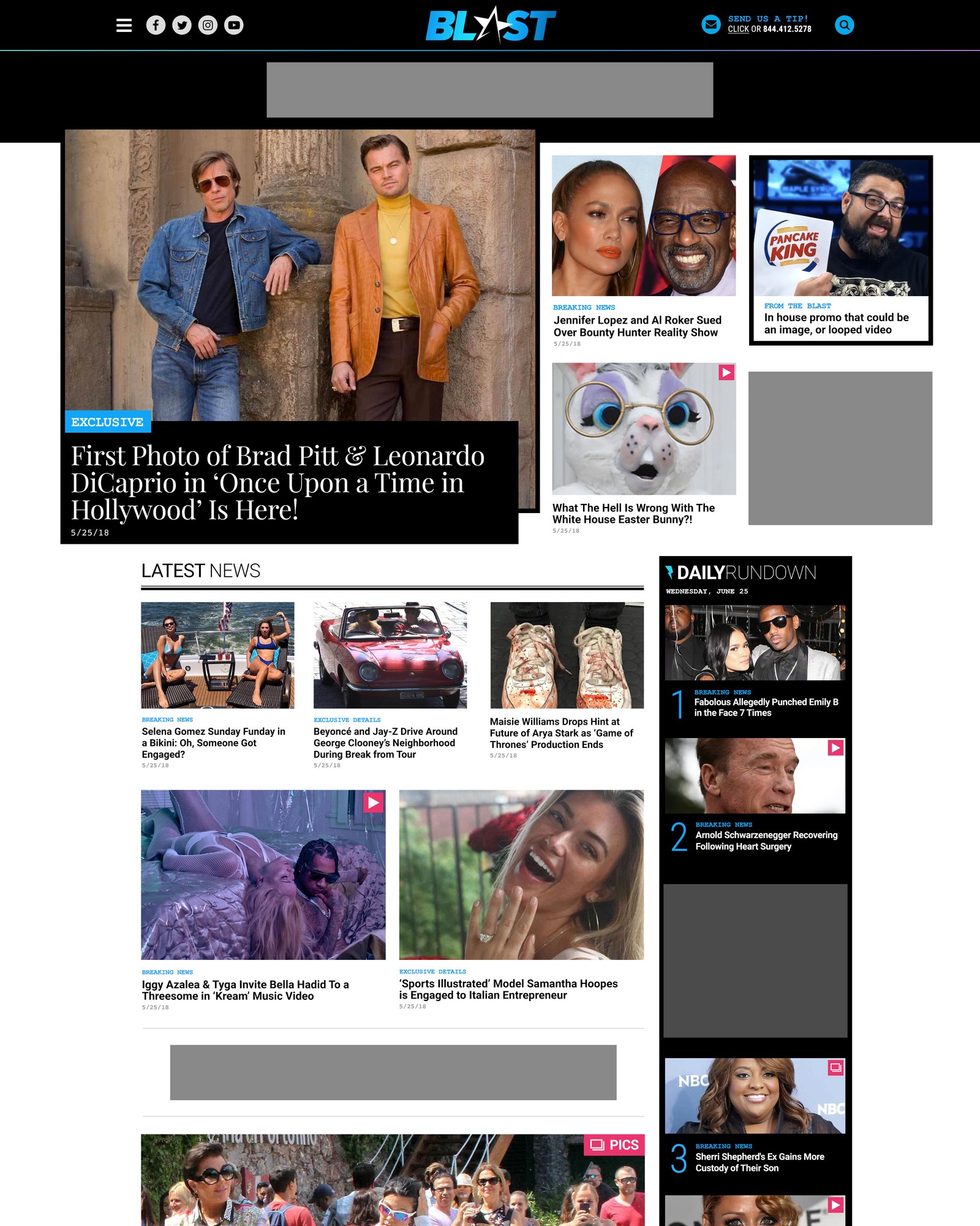
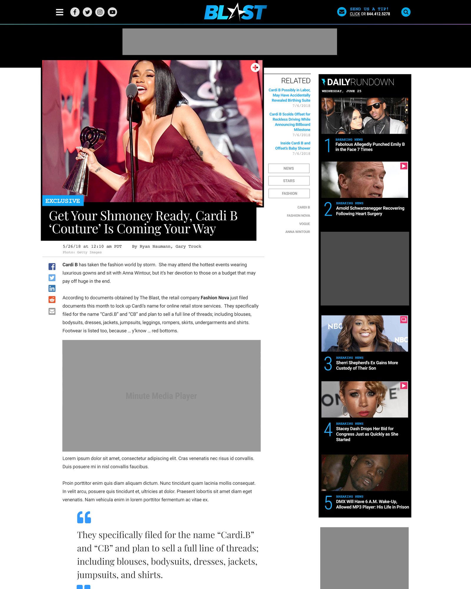
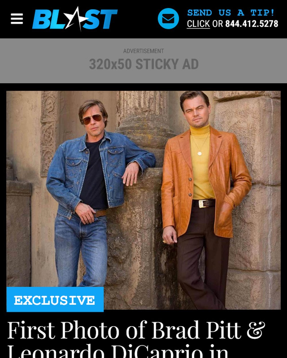
A site that publishes every few minutes cannot be precious. It has to load fast, hold an ad, and put the story first. The launch site was a dark masthead, the star, and a photo-led grid, built in weeks. A year later, with real traffic behind it, every template was redrawn at desktop, tablet and phone, with the ad positions designed in rather than dropped on.
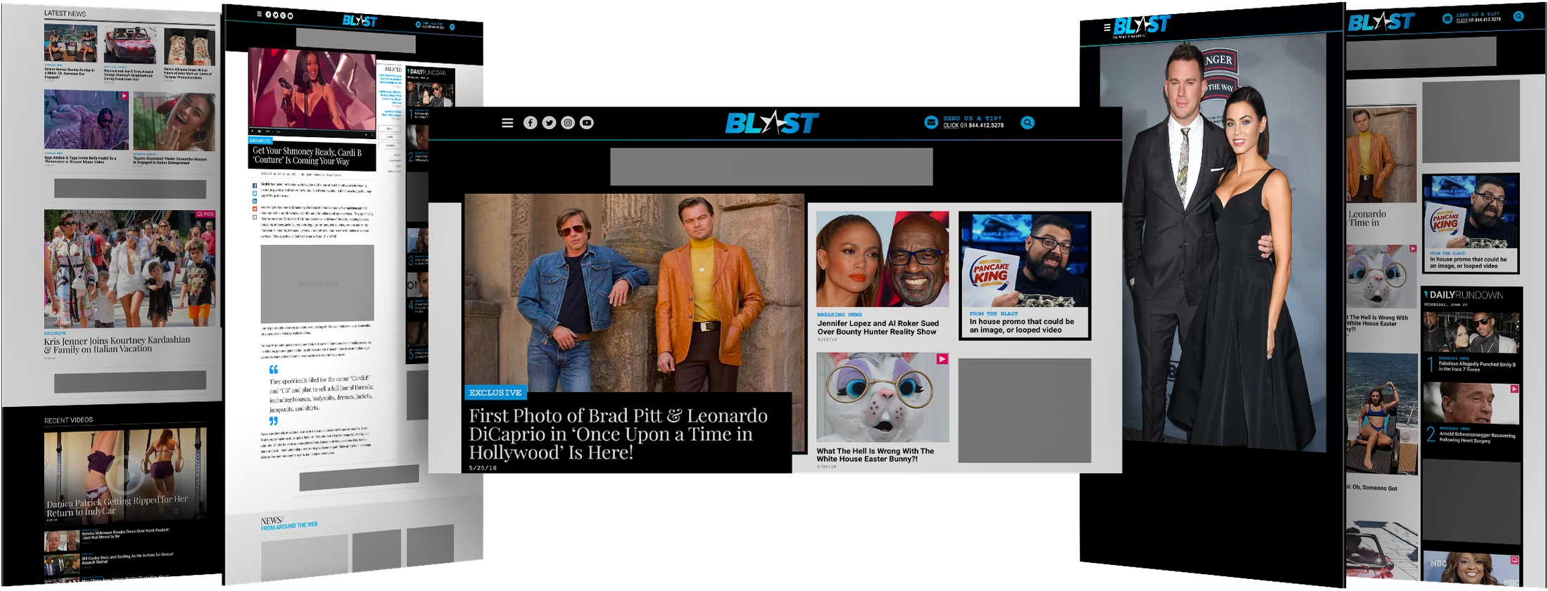
Five templates, each at three breakpoints: home, article, video article, gallery and category. The masthead and the lead story stayed where readers knew them. Everything underneath was rebuilt to hold a sponsor’s skin without losing its shape. The deck that went out that August announced it as the fall refresh.
Social · Video
Most readers never saw the homepage. They saw a post.
So the brand was designed feed-first. A profile skin for each network, a square template for the nights that matter in celebrity news, a birthday card, a corner bug for every photo, and a motion system for Instagram stories that a producer could fill from a headline. YouTube got its own open and close: the star with a VHS transition into the clip, and an end card with the watch, subscribe and follow slots already in place.
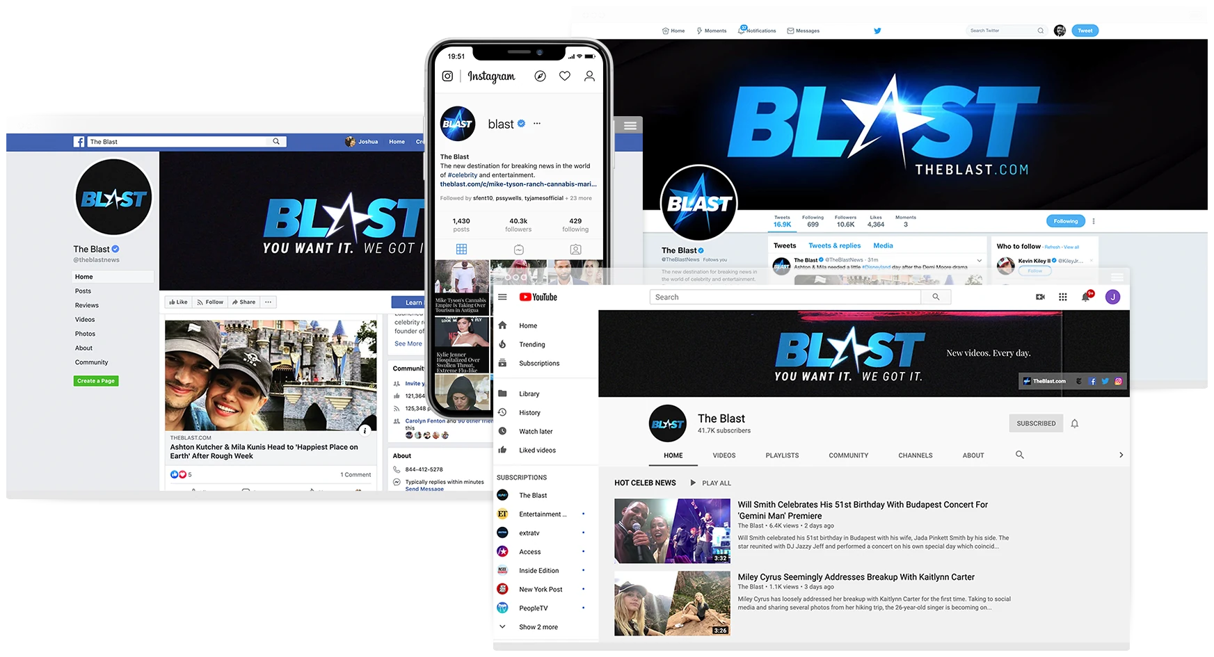
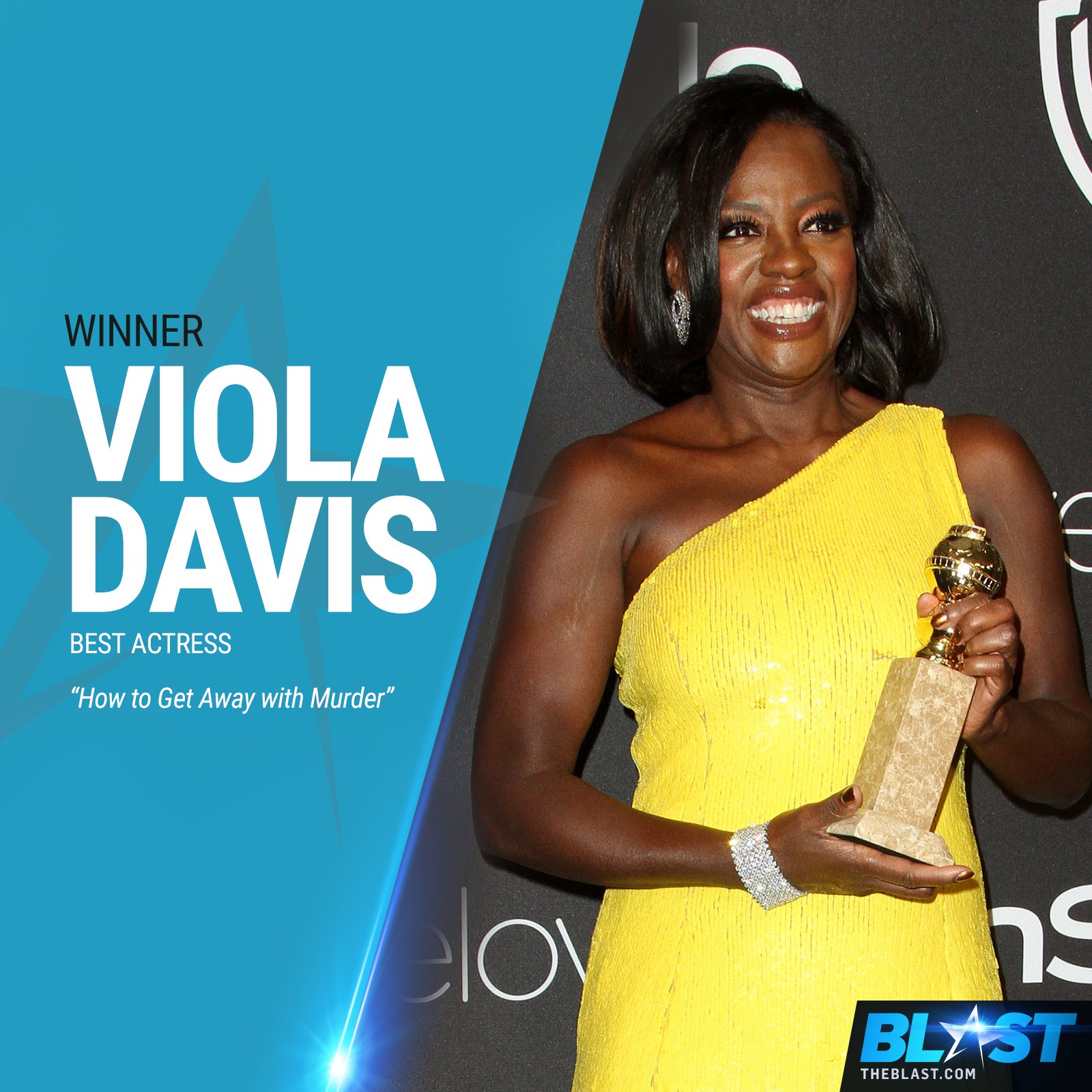
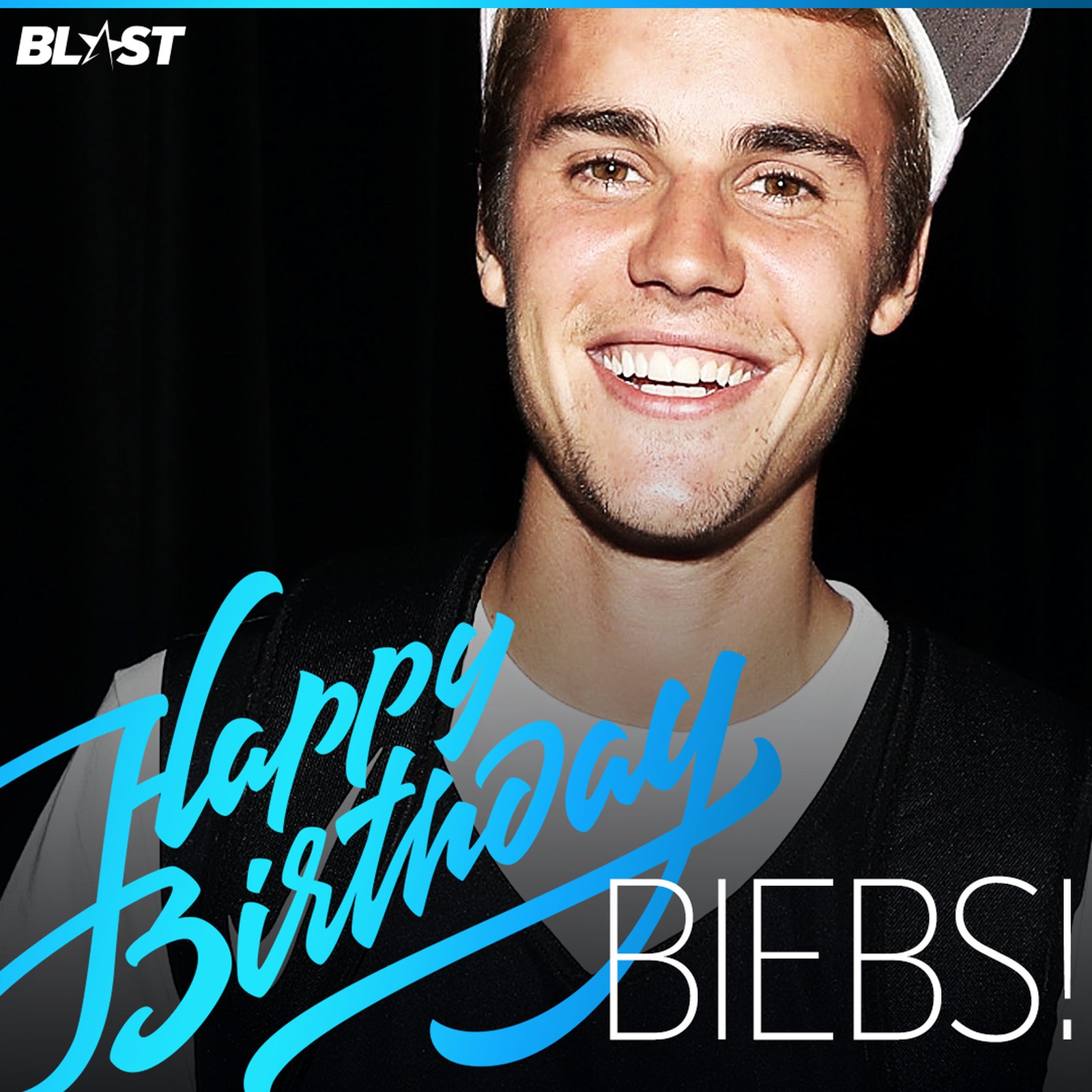
The Instagram story system is three layers a producer fills in: the photo, the name, the headline. The YouTube bumper opens with the star and a VHS transition and closes on the end card. And the studio, where the video was meant to be made, was rendered in 3D first.
Sales · August 2018
A newsroom pays for itself with an audience it can prove.
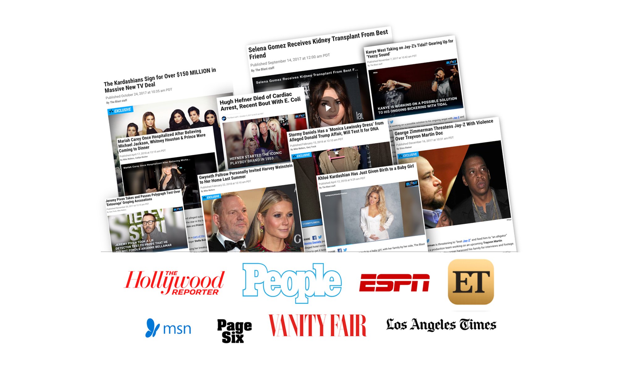
A year in, The Blast had numbers worth showing. The traffic, the press, the syndication deals with MSN, Oath and Sinclair. The general deck put them in front of a partner in the brand’s own type and color: what we do, the launch, The New York Times, the stories the rest of the press picked up, the refresh, the stats. Fifteen pages in August 2018, revised again in April 2019.
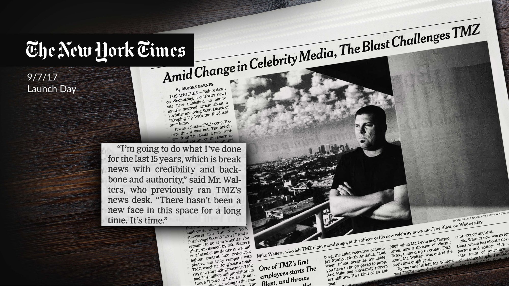
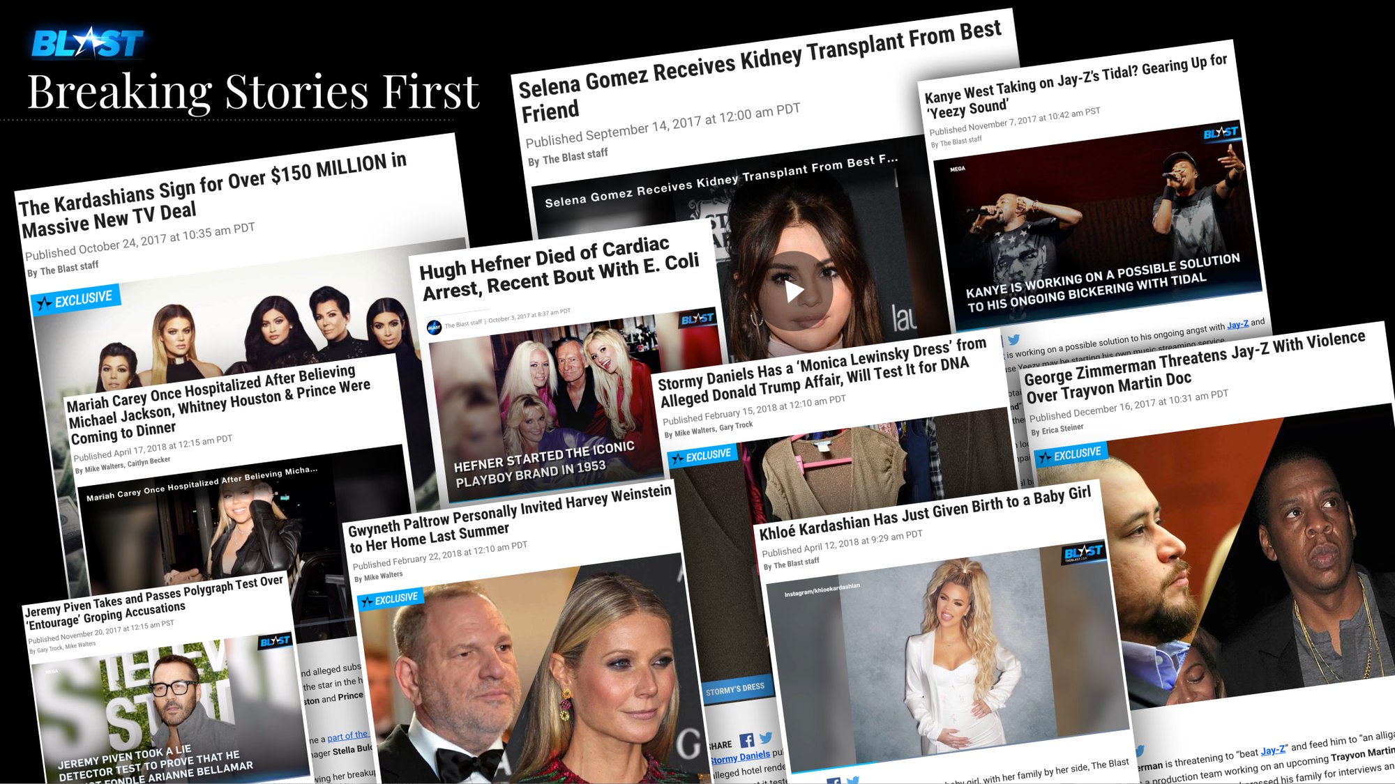
TMZ taught me speed. The Blast taught me what it takes to start a newsroom from nothing: the brand, the product and the business have to arrive together, because none of them works alone. That is the job I carried into Amazon MGM Studios, where the newsroom was inside the company and the audience was ten thousand employees.
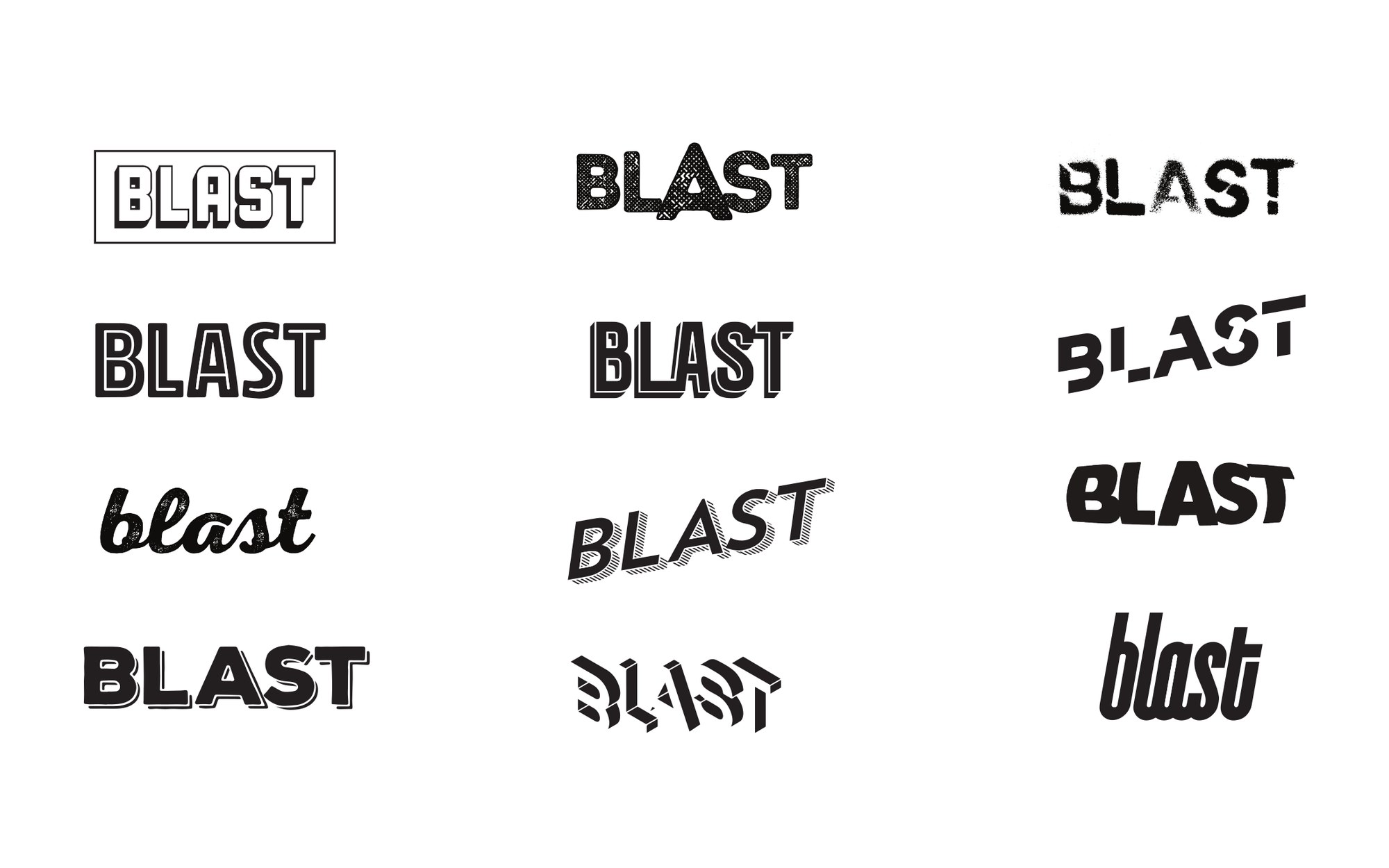
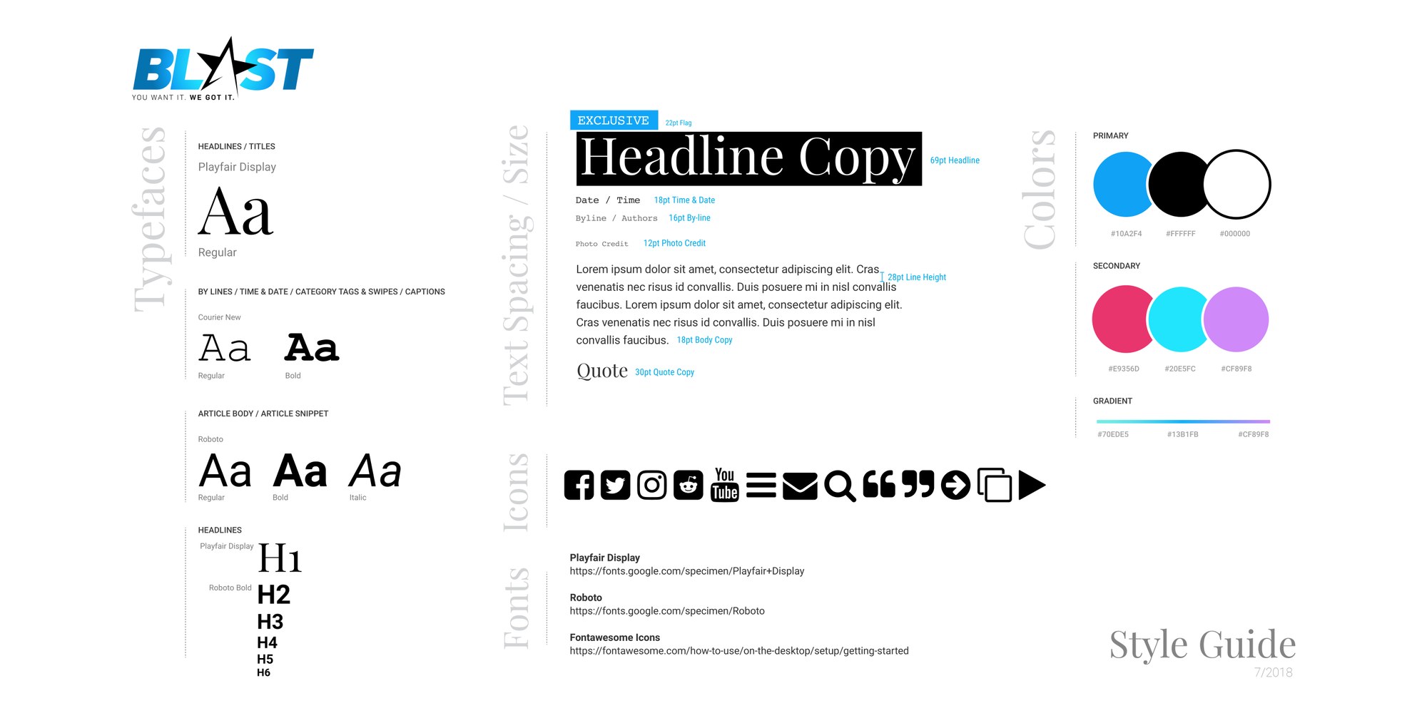
Identity. The Blast mark, chosen from twenty-five pages of alternates, and its one-page guide.
Site. The launch site, then the 2018 redesign at three breakpoints.
Social system. Skins, templates and a story motion system for every network.
Video. Bumpers, end cards, the logo reel, and a rendered studio.
Sales. The general deck and the syndication logo kit.
Newsroom. Stationery and templates the desk could run without a designer.
Tell me what you're building and where it's stuck. I'll tell you honestly whether I'm the right person for it.